NGT
Back to the case study

Full walkthrough · AGNI · Coaching holístico · 2026

Agni

The website of a holistic healing school: therapies with their own page, a three-level training, Bach flower remedies ordered one at a time and a lunar calendar that works itself out. The site screenshots are what is published today. The admin screenshots come from a test copy with made-up data, because the real panel holds the client's data.

agnicoachingholistico.com
  • Next.js 15
  • Prisma
  • Postgres · Neon
  • Auth.js
  • Cloudinary
  • VPS · Docker
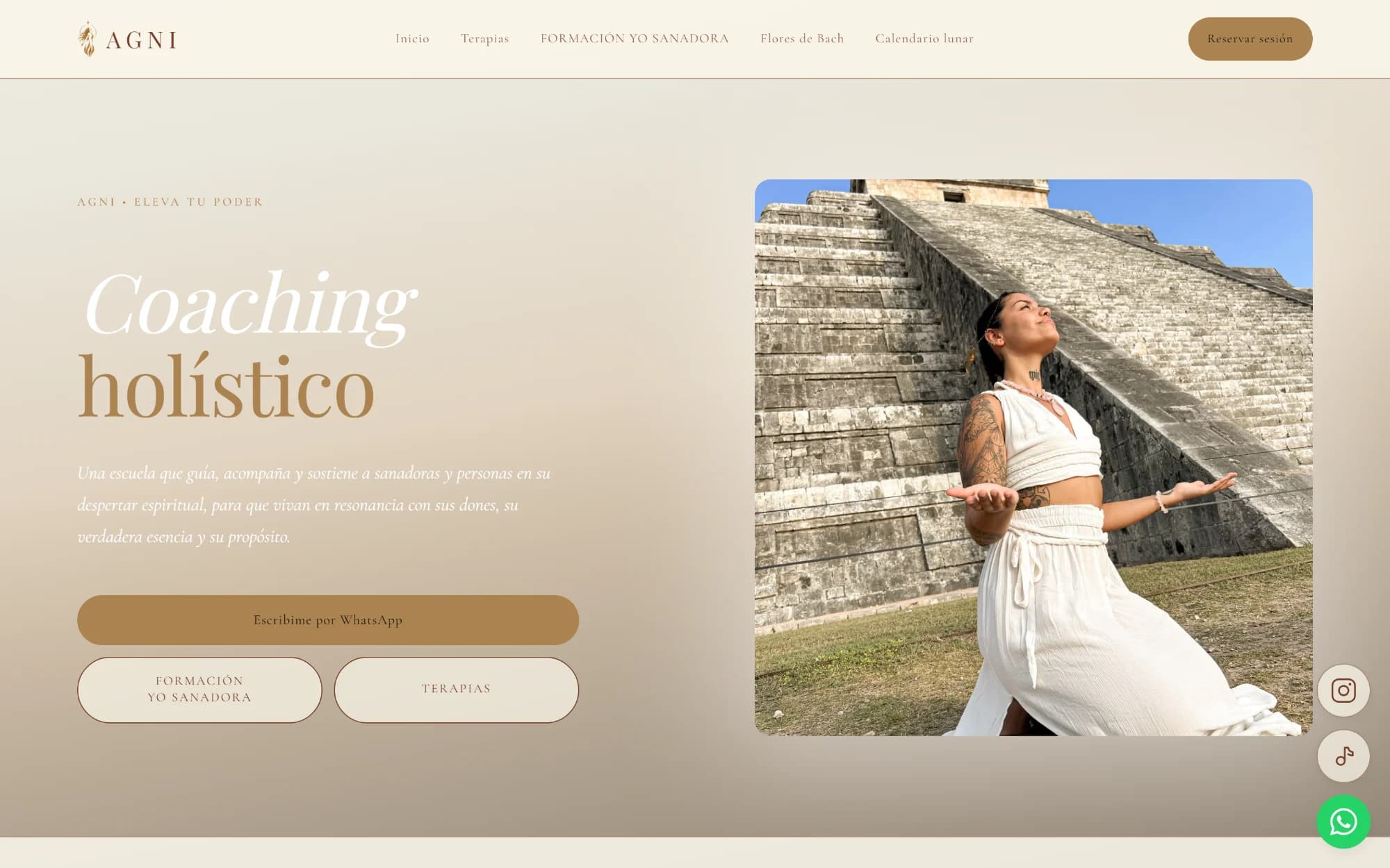
AGNI home page: the headline “Coaching holístico” over a photo of the coach in front of a pyramid, with the WhatsApp, training and therapies buttons
Three ways out on the first screen and none of them is a form: message on WhatsApp, go to the training or go to the therapies. That is how this gets sold.

Home page

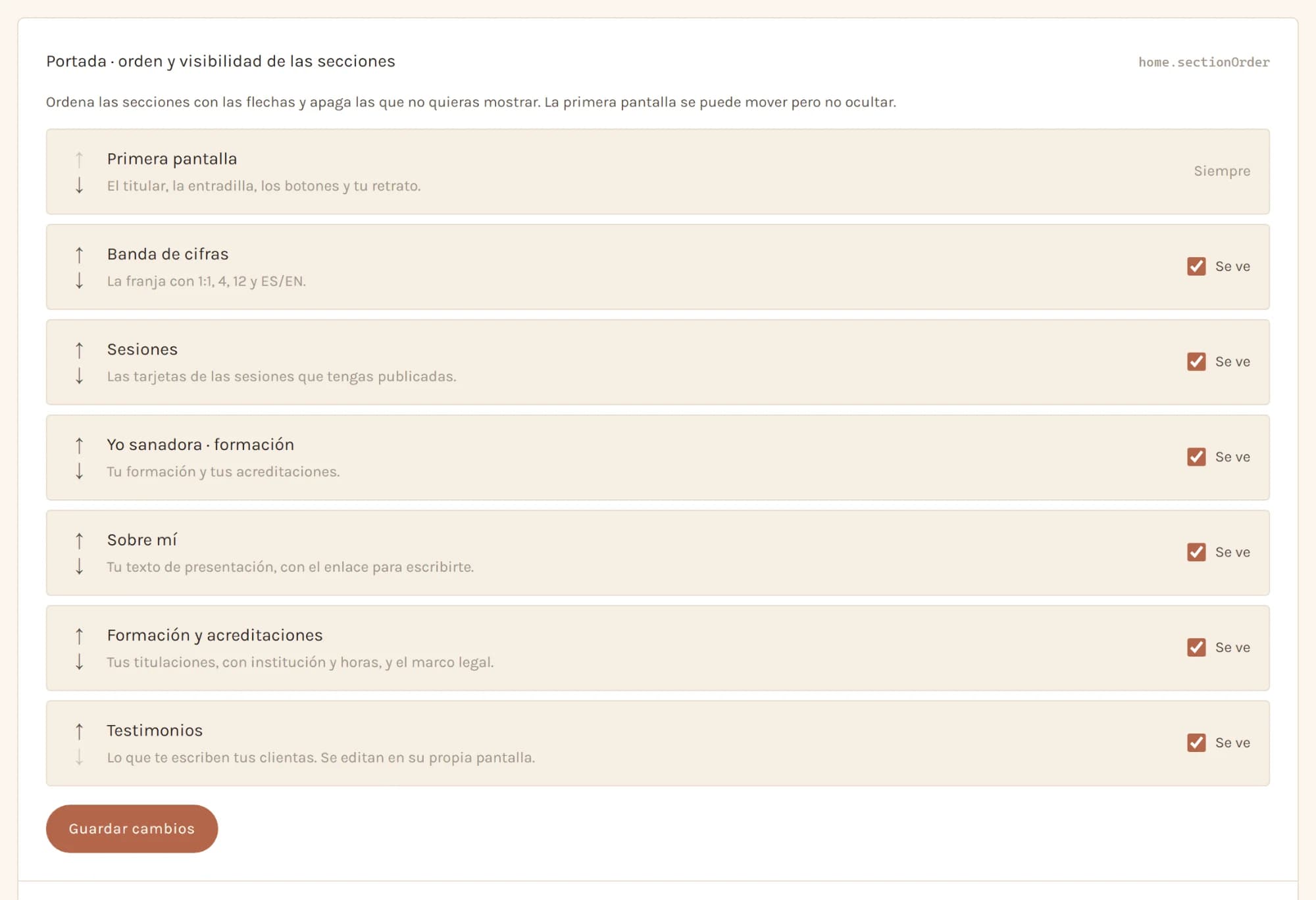
Every home page section is reordered and switched off from the panel

Below the first screen come the training, her introduction, her credentials and the legal framework she works under. The order isn't written in the code: she decides it with two arrows, and a section switched off leaves the site without losing anything she had written in it.

The first screen is the only one that can be moved but not hidden. A home page without a headline isn't a home page, and the panel doesn't let you get there.
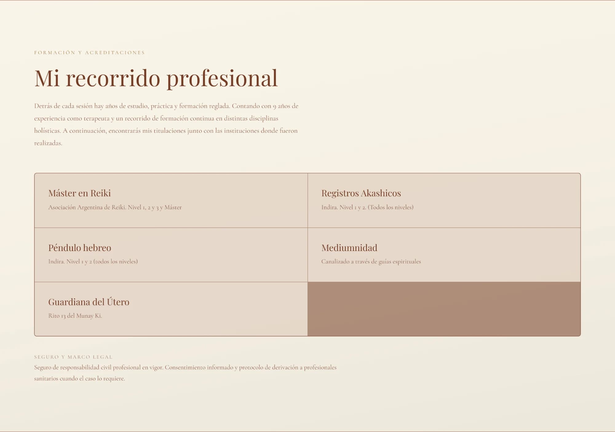
“Mi recorrido profesional” section with her qualifications — Reiki Master, Akashic Records, Hebrew pendulum and others — and the legal framework
Admin screen listing the home page sections, each with arrows to reorder it and a “Visible” checkbox
Each row says what's inside in her own words — “your training and your credentials” — not with the name the section has in the code.

Therapies

One page per therapy, to send over WhatsApp

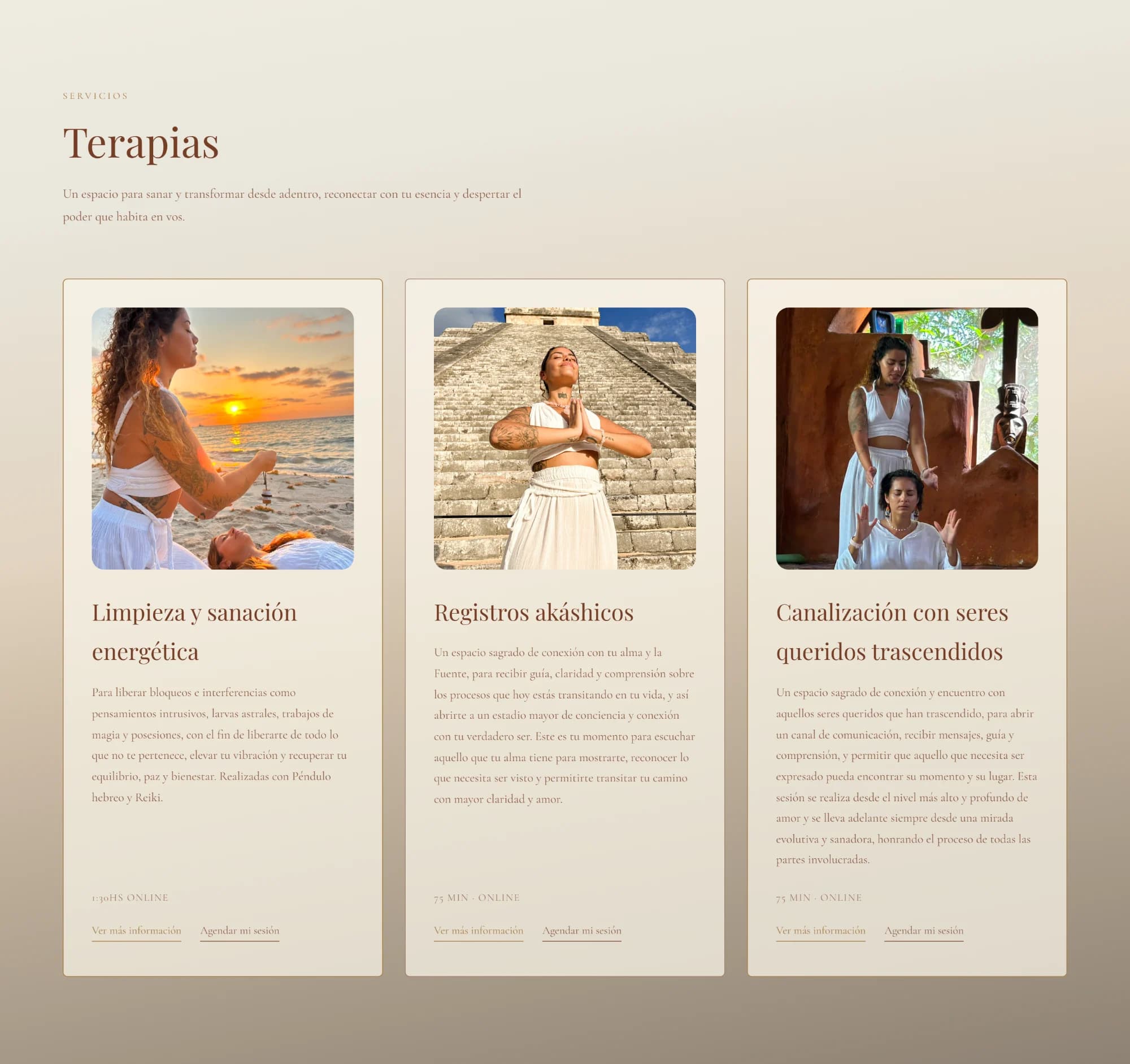
At first every therapy's details were stacked on a single page: anyone scrolling down read all three in full without having picked one, and each card's “see details” link took them somewhere else on that same page. Now the index is just that, an index, and each therapy has its own address, which is what gets shared on WhatsApp when someone asks.

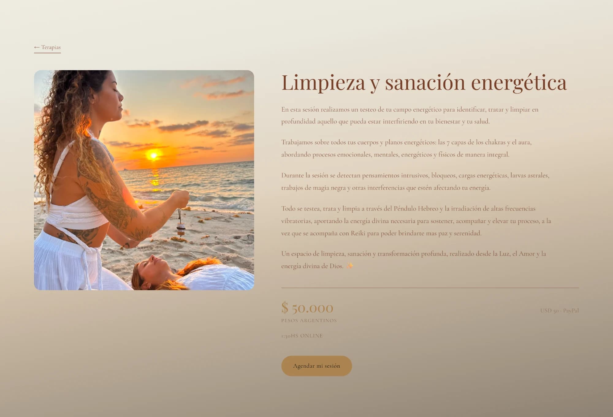
The page carries the long description with the price at the end, which is where she asked for it. It's in pesos and, if filled in, in dollars through PayPal too, for people booking from abroad. The button opens WhatsApp with a message that already names the therapy, so the chat doesn't start with “which one was it?”.

Therapies page with each session's card, its square photo and the link to its page
“Limpieza y sanación energética” page: the photo, the description in paragraphs, the price in pesos and dollars, the length and the “Book my session” button
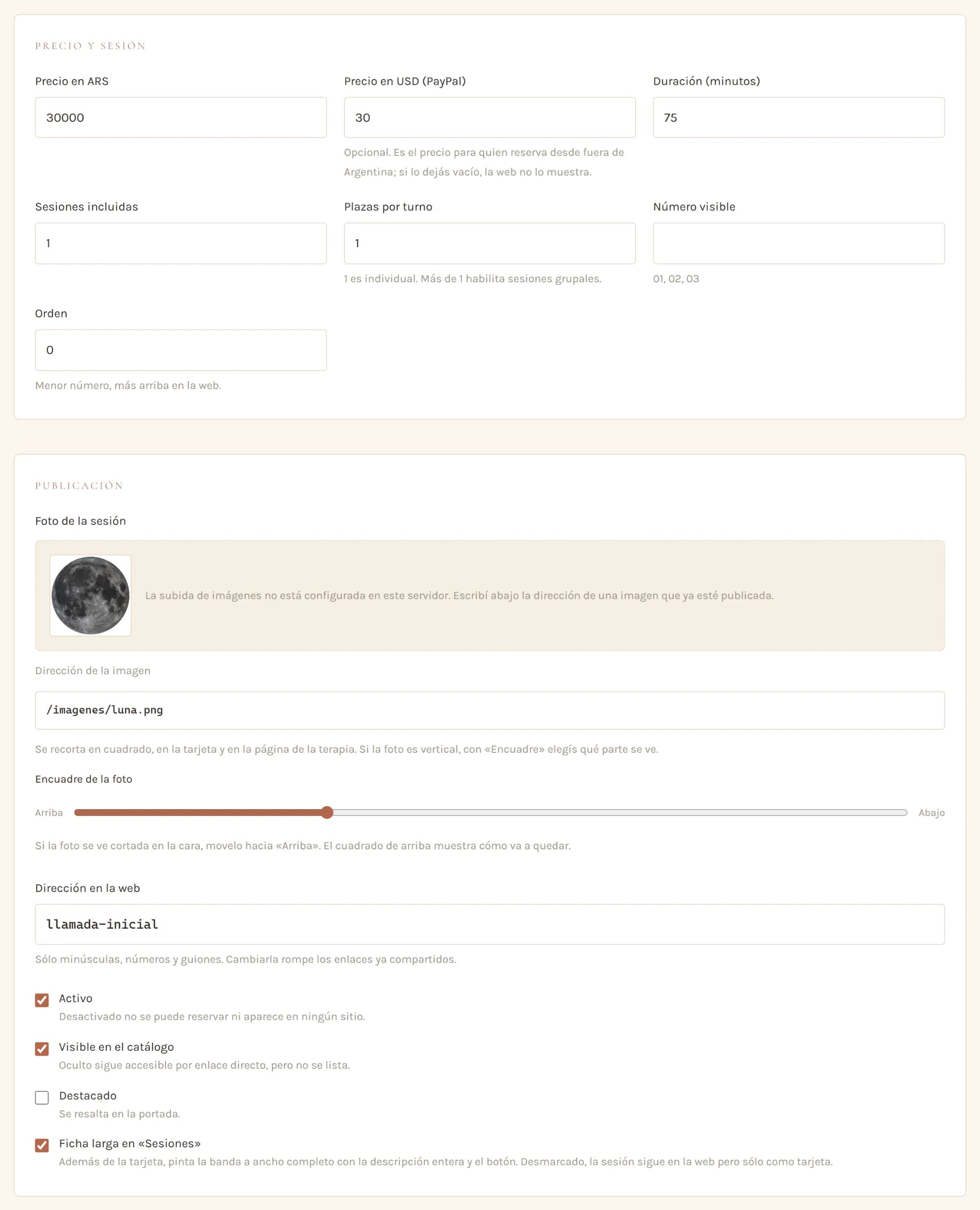
A therapy in the admin panel: prices in pesos and dollars, length, places per slot, the photo with its framing slider and the publishing switches
Photos are square across the site, and a portrait photo cropped through the middle cut off the head of whoever was in it. The framing slider picks which part shows, and the little square above shows how it will look before saving. The notice saying images can't be uploaded belongs to the test copy, which has nowhere to store them; on the real one, the upload button sits there.

Training

Yo Sanadora: three levels, one a month

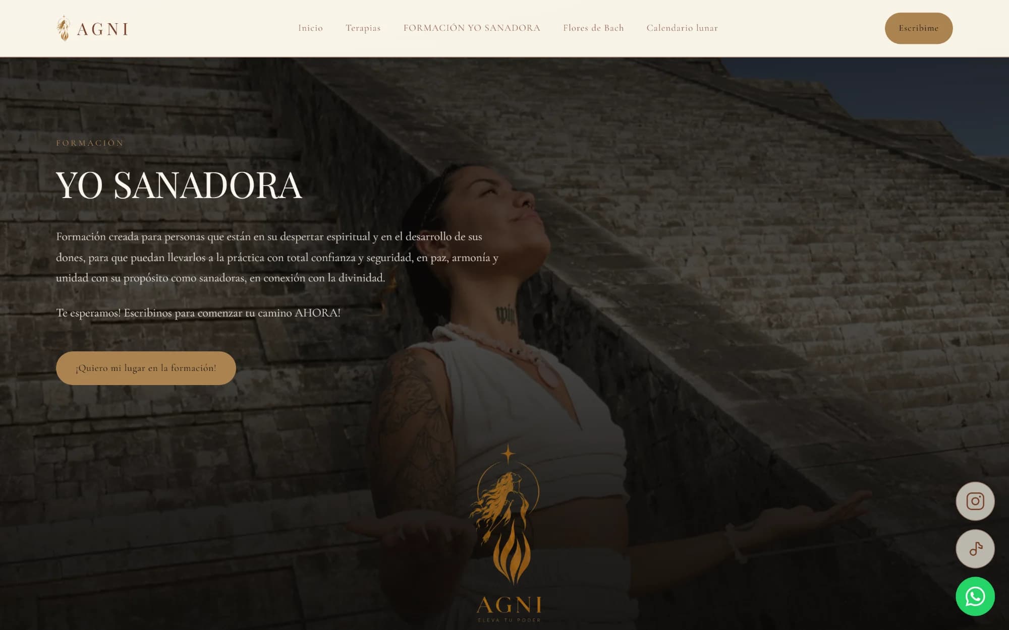
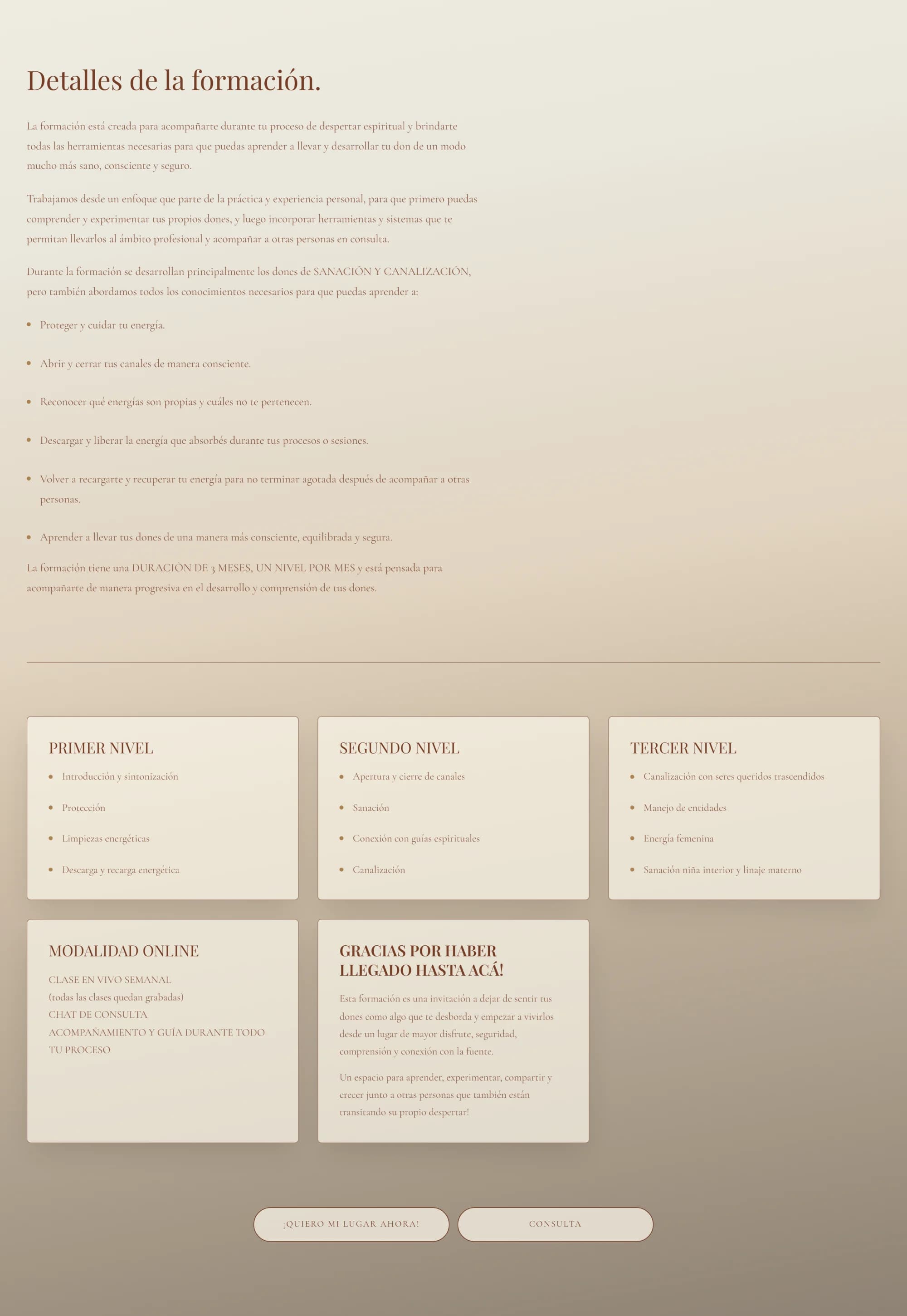
The training has a page of its own. It opens over the same photo as the home page, goes on with the detail of what's learned and shows the three levels as cards that appear one at a time as you scroll and float while they're on screen. The floating was “to try it out”, so it has its own switch.

At the very bottom there are two buttons, not one: “I want my place now!” and “Ask a question”. Each opens WhatsApp with its own message, so on the other end you know, before replying, whether the person wants to sign up or has a question.

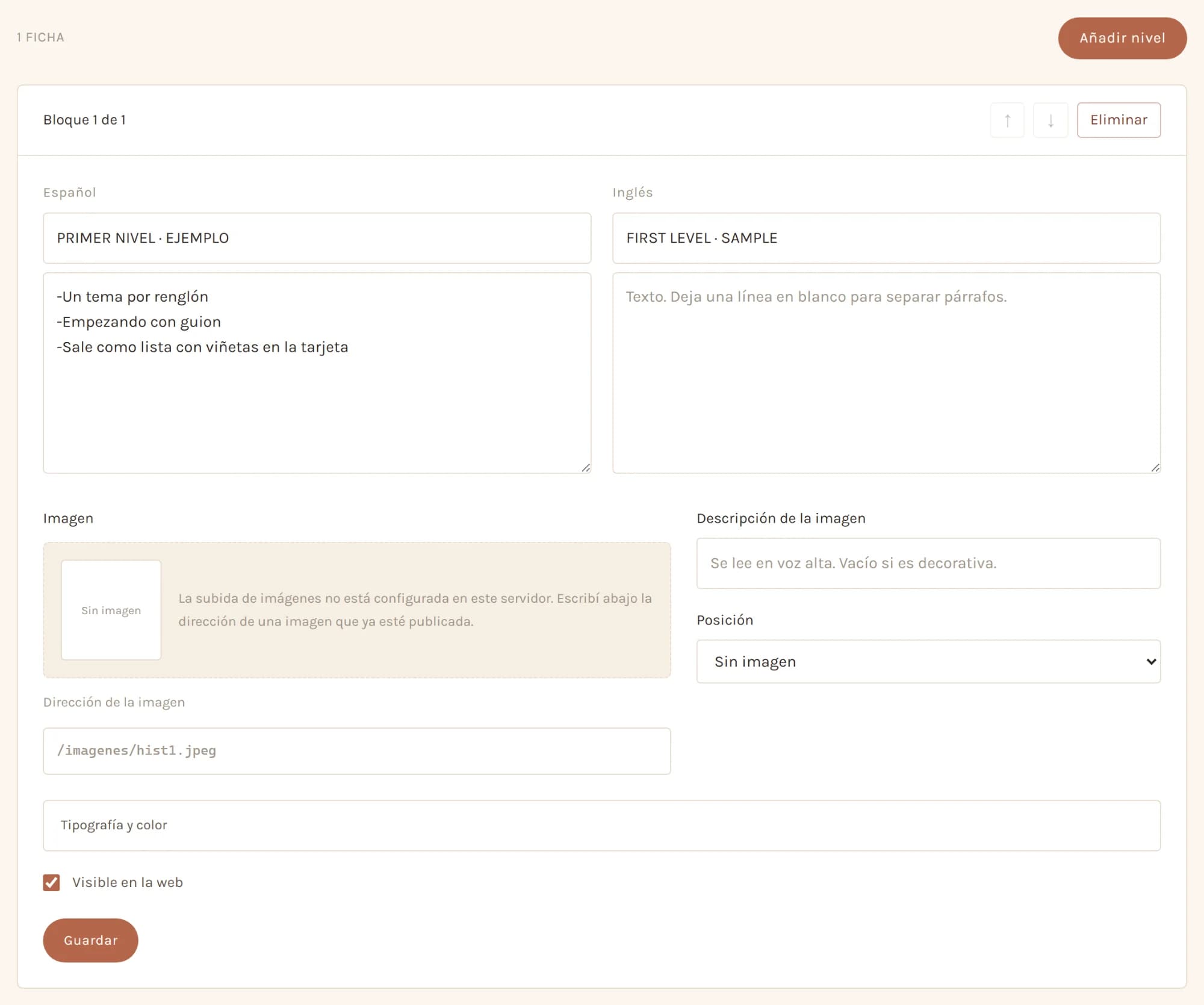
Each level is a block in the panel: a title and a text. She wrote the syllabi with a dash at the start of every line, and on the site they came out glued into one paragraph. Now a line starting with a dash comes out as a bulleted list, without her having to learn any markup.

Header of the Yo Sanadora training over the coach's photo, with the dark veil and light lettering
Training details, the three level cards with their topics, the online format and the “I want my place now!” and “Ask a question” buttons
A training level in the admin panel, with the Spanish text written as lines starting with a dash
The sample text belongs to the test copy and says how it's used: one topic per line, starting with a dash.

Bach flowers

A catalogue where each blend is ordered on its own

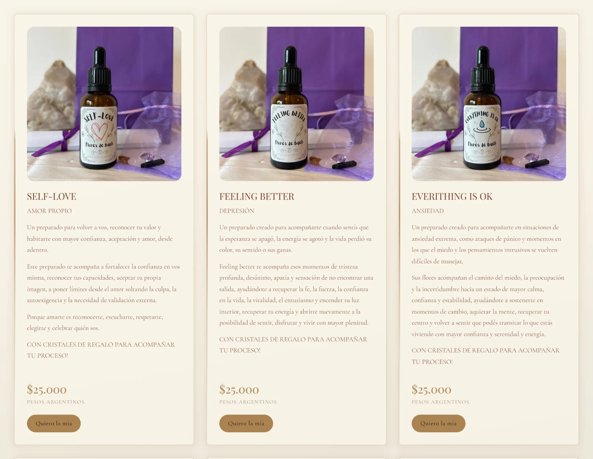
Each blend is a card of its own with its photo, its text, its price, a note shown highlighted and its own WhatsApp button, because they're sold one at a time and shipping is arranged with each person. A card can carry up to twelve photos and videos, swiped with a finger or with arrows like in a shop.

Below there used to be a list of the 38 Bach flowers grouped by emotional state. She asked for it to go, and it wasn't deleted: it was switched off from the panel. All 38 are in the database, one click from coming back.

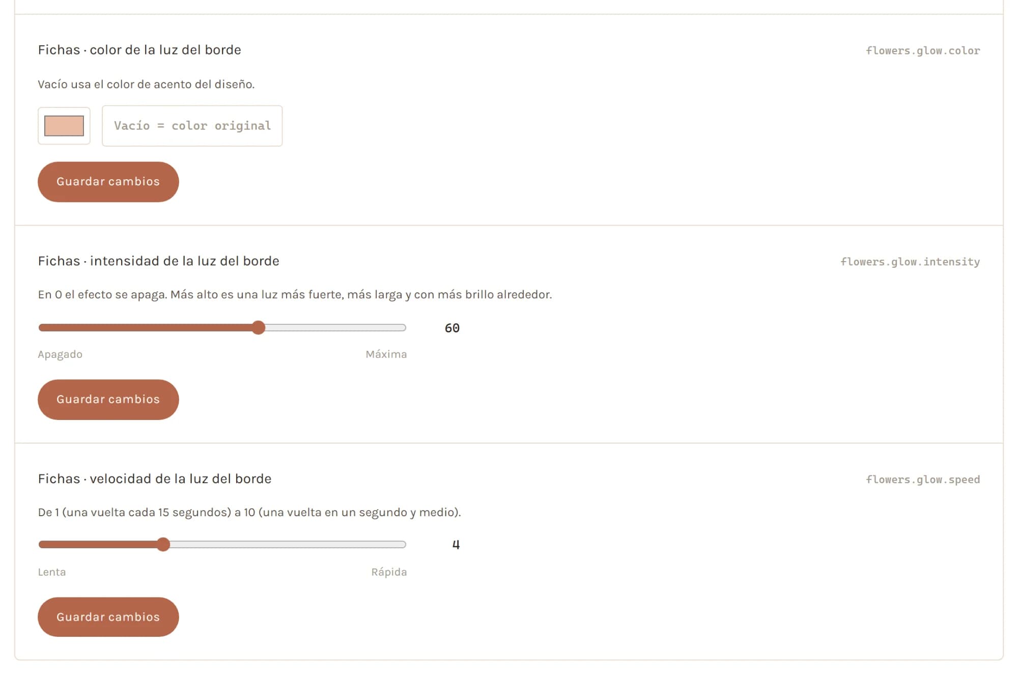
Each card's border has a light running around it. Colour, intensity and speed are chosen from the panel, and the light stops on its own when the card leaves the screen: it doesn't spend battery on something nobody is looking at.

Three cards from the Bach flower catalogue, each with its photo, text, price and button
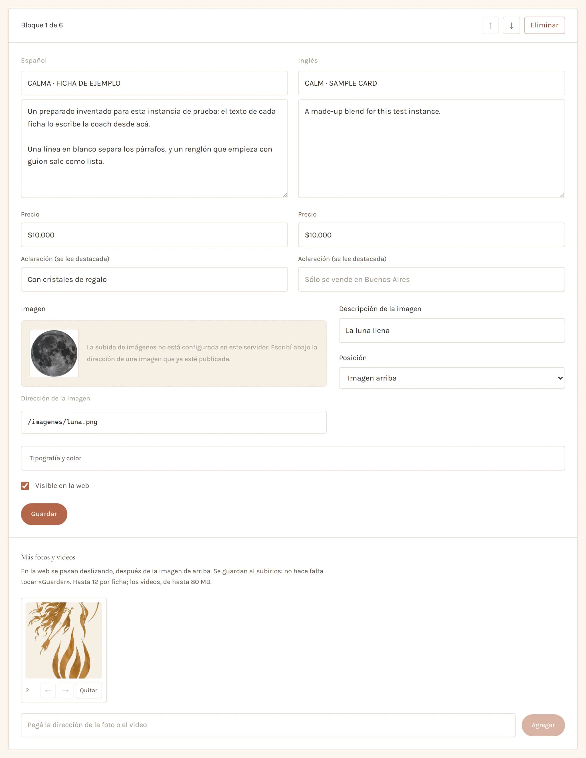
A flower card in the admin panel: title and text in two languages, price, note, the main photo and the “More photos and videos” section
The extra photos and videos are saved on upload, without pressing “Save”, and reordered with the arrows. The “Calma” card is made up, like everything in the test copy.
The three border-light controls: colour, intensity on a slider and speed on a slider
At zero, intensity switches the effect off completely: no trace of it is left on the page. And speed isn't an abstract number: the panel says 1 is one lap every 15 seconds and 10 is one in a second and a half.

Lunar calendar

Today's moon, worked out without asking anyone

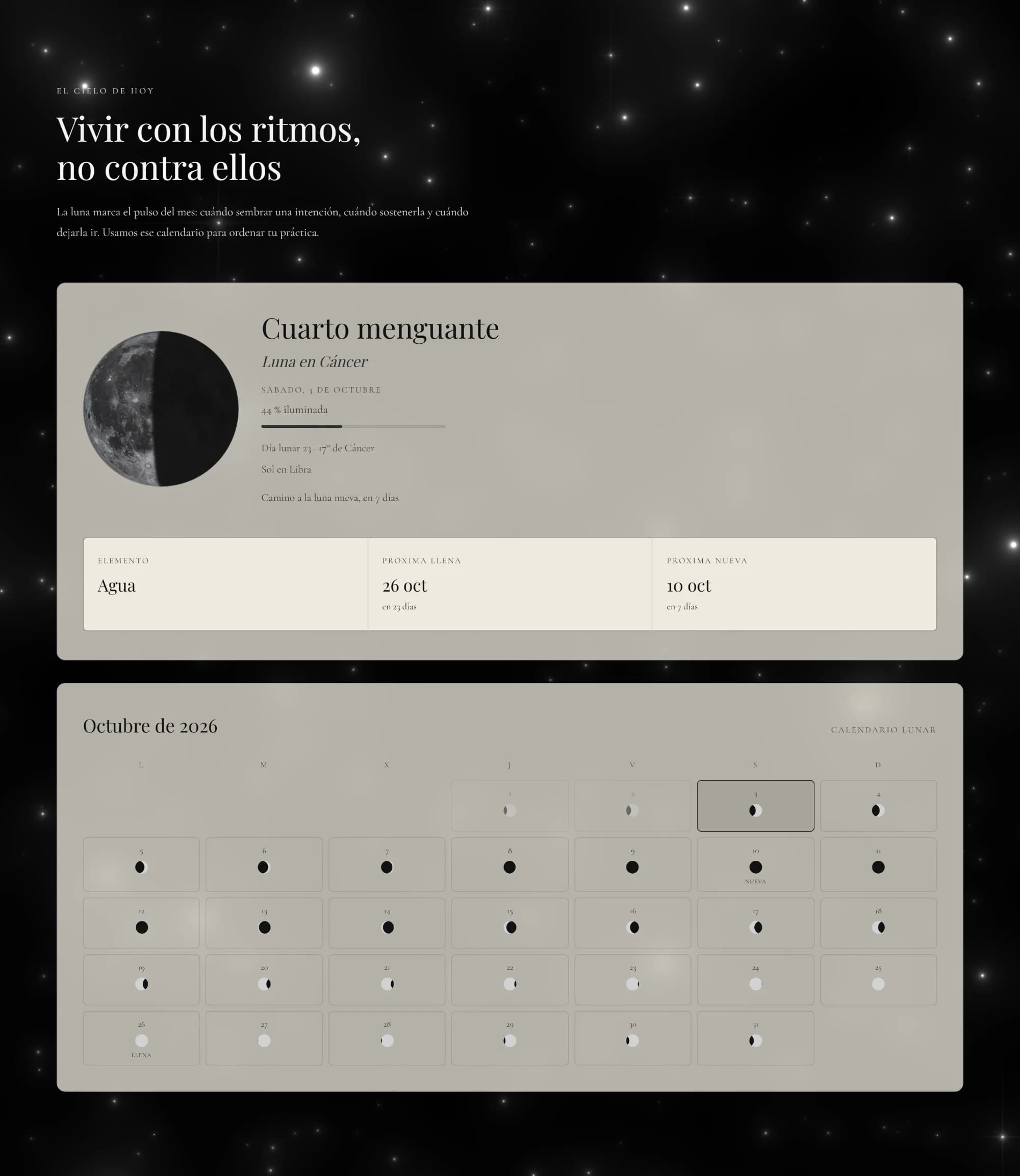
The phase, how much of it is lit, which sign the moon is in, the lunar day, the sun, the element, when the next full and new moons are, and the whole month with each day's phase. None of it is fetched from an outside service: it's calculated on the server itself with Jean Meeus's astronomical algorithms, with under 0.3° of error in the moon's position and under two minutes in the moment of each new and full moon.

Relying on a service for that would have meant a network call on every visit, a page that breaks the day that service goes down or starts charging, and one more key to look after. All for a figure that comes out of plain arithmetic.

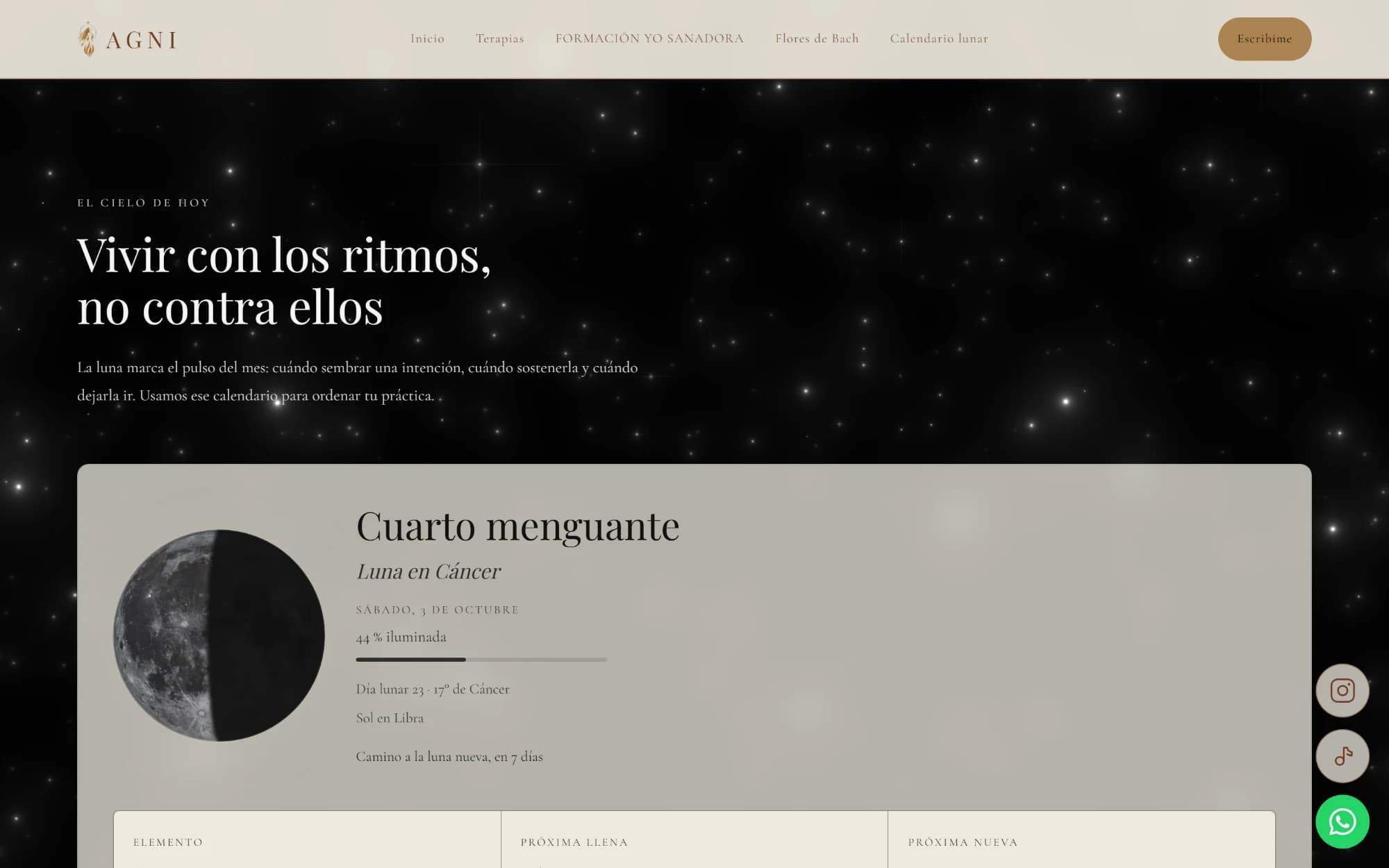
Behind it runs an animated starry sky, and the cards are translucent so it shows through them blurred, which is how she asked for it. The light grey lettering gave a 3.1:1 contrast on that background and was darkened to 4.9:1, which reads.

Lunar calendar page with its headline over a black starry sky
Today's moon — phase, sign, illumination, next moons — and the month's calendar with each day's phase, on translucent cards over the stars

Admin panel

A dashboard that doesn't ask you to know about websites

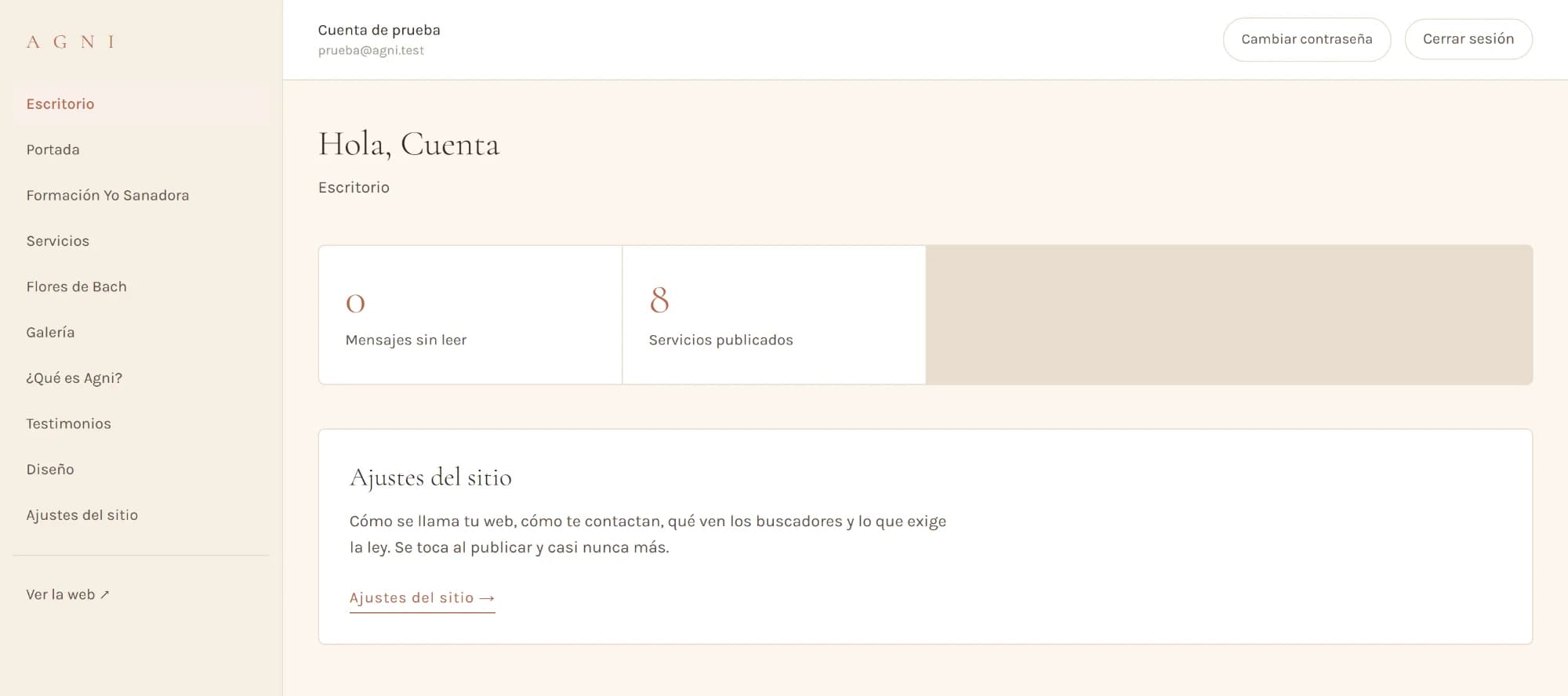
The menu carries the names of what's on her site — the Yo Sanadora training, Bach flowers, What is Agni? — not the names of a website's parts. And the rule that shaped the whole project was hers: everything in the panel shows on the site, and everything you'd want to change on the site is in the panel.

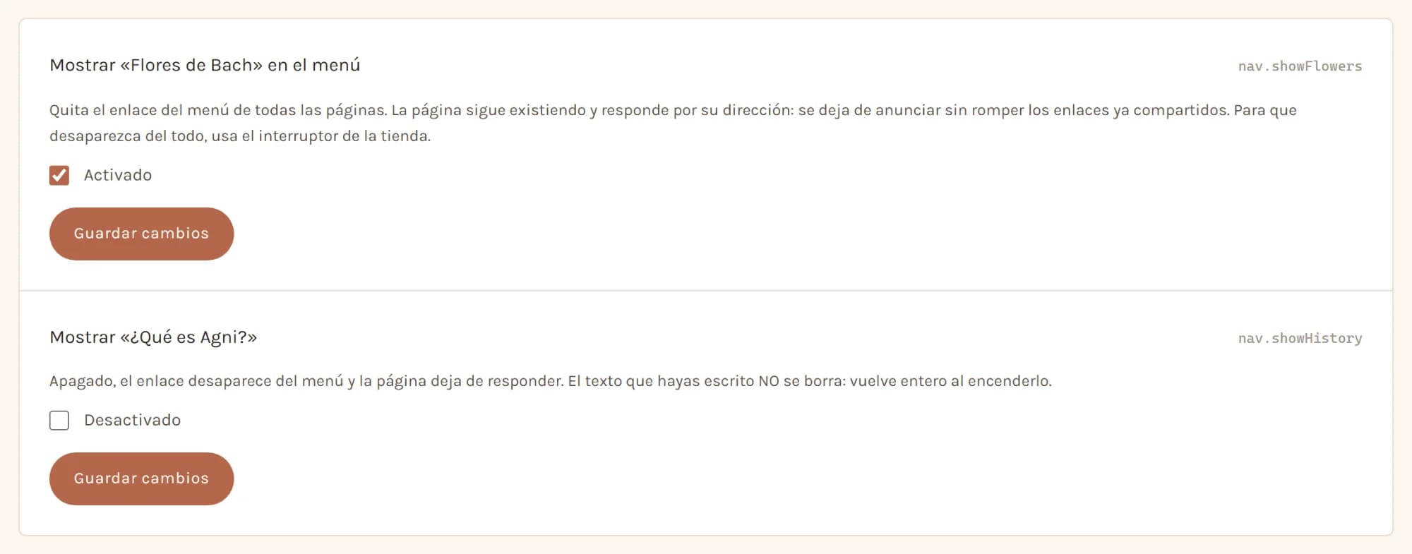
That rule has a consequence you can see in every switch: hiding isn't deleting. Turning off “What is Agni?” takes the page out of the menu and stops serving it, but the text stays saved and comes back whole when it's turned on. Taking the flowers out of the menu stops advertising them without breaking links that were already shared.

AGNI admin dashboard with the side menu and a test account
The switches to show or hide “Bach flowers” in the menu and the “What is Agni?” page, each saying what happens when it's turned off
Both switches say what happens when they're turned off before anyone turns them off.

Design

No colour is written into the code

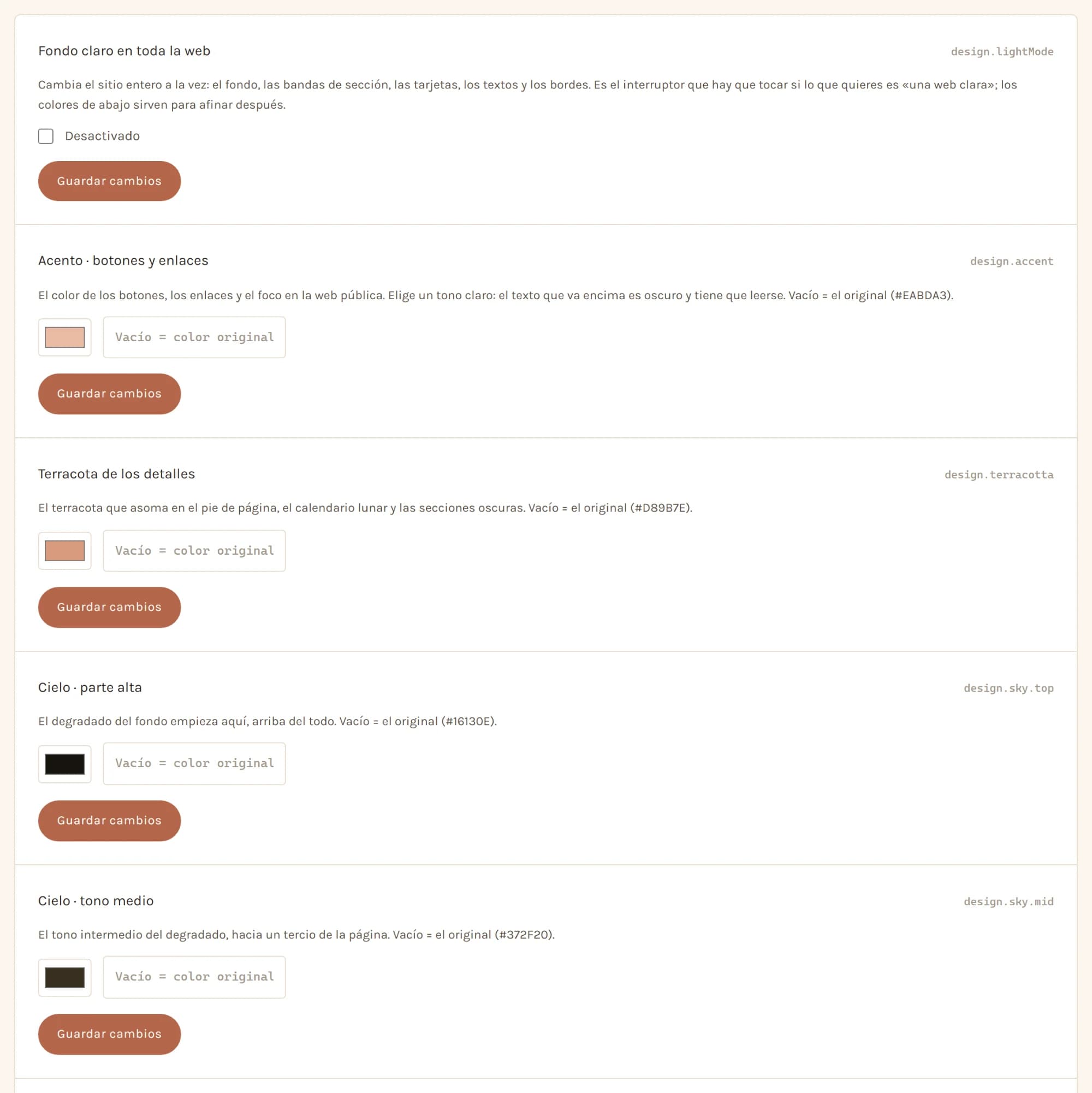
From “Design” the whole site changes: one switch turns it light in one go — background, cards, text and borders — and below you fine-tune the colour of buttons and links, the terracotta of the details and the three stops of the background gradient. Each field says where it will show and what the original colour is if left empty, so clearing one never leaves the site colourless.

One of the requests read “I change the colour, save it and it goes back to the usual one”. The panel saved fine; it was the site that applied the colour around the paragraphs rather than on each one, and each paragraph's own style won. It happened in seven places on the site. It was fixed in all seven, and an automated test now fails if it ever comes back.

The admin “Design” screen: the light background switch and the accent, terracotta and sky colours, each with its explanation and original value

On a phone

What gets shared on WhatsApp opens on a phone

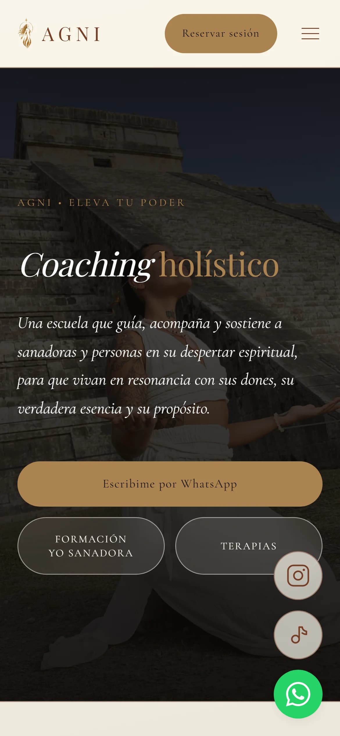
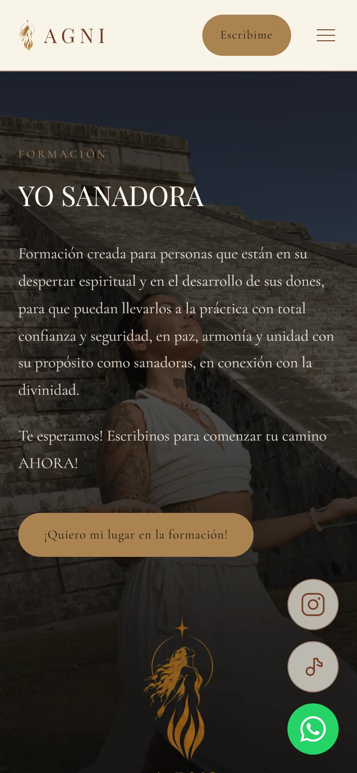
The addresses of the therapies, the training and the flowers travel over WhatsApp, and there they open on a small screen. That's why WhatsApp, Instagram and TikTok are always within reach, floating at the bottom right, and every round of changes is also checked at the width of a phone.

AGNI home page on a phone, with the WhatsApp, training and therapies buttons and the floating Instagram, TikTok and WhatsApp shortcuts
Header of the Yo Sanadora training on a phone, with the gold logo at the bottom
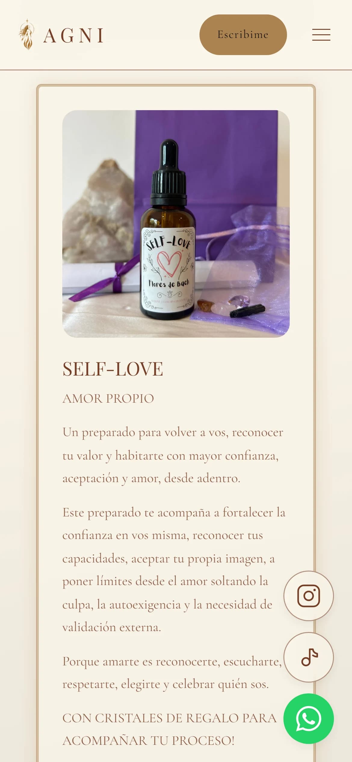
A Bach flower catalogue card on a phone

Under the hood

What you don't see and holds the rest up

The site is written in two languages and English is switched off on purpose: a switch hides it and sends any English address to its Spanish version, without a single translation having been deleted. The day she wants to work in English, it gets turned on.

What search engines see is also handled from the panel. Permission to show up on Google is a single setting, and the tag on every page, the file for search engines and the sitemap all come from it: a page can never say “index me” while the file says the opposite.

Nothing she writes is published as code, and every panel action checks on its own that whoever asks for it is allowed to, even if the request arrives without going through the screen that offers it. There are 461 automated tests that run on every change pushed. Since 30 September it lives on its own domain, served from NGT's server, and whatever reaches the main version goes live on its own, with no files uploaded by hand.

Want something like this for yours?

None of these sites was built from a template. Tell me what you sell and what you're fighting with today, and we'll see what can be done.