NGT
Back to the case study

Full walkthrough · Kiki Estampado · 2025

Kiki Estampado

A printed apparel store that doesn't sell sixty-two products: it sells thirteen designs printed onto one single pile of blank garments. These are its screens.

  • Next.js
  • Turbopack
  • Cloudinary
  • Mercado Pago
  • Andreani
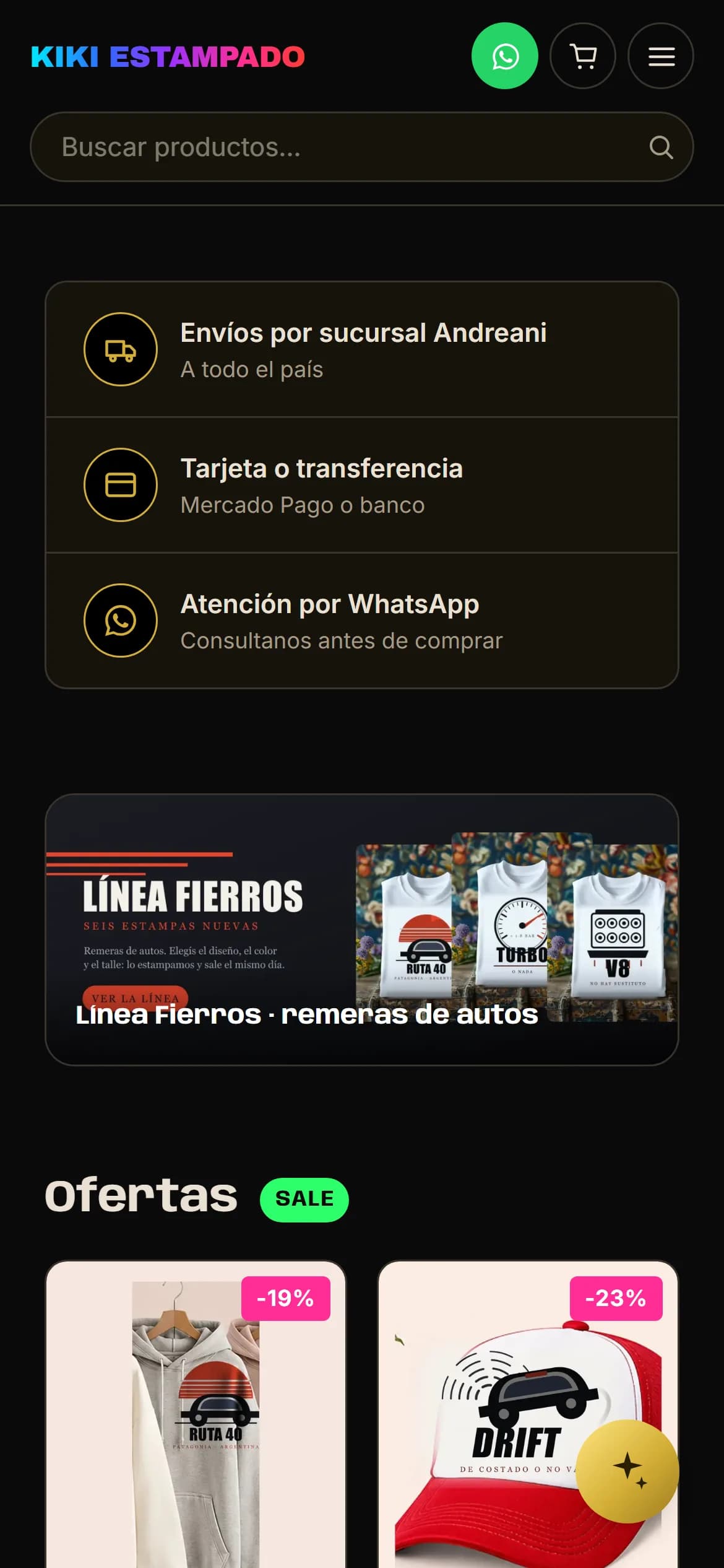
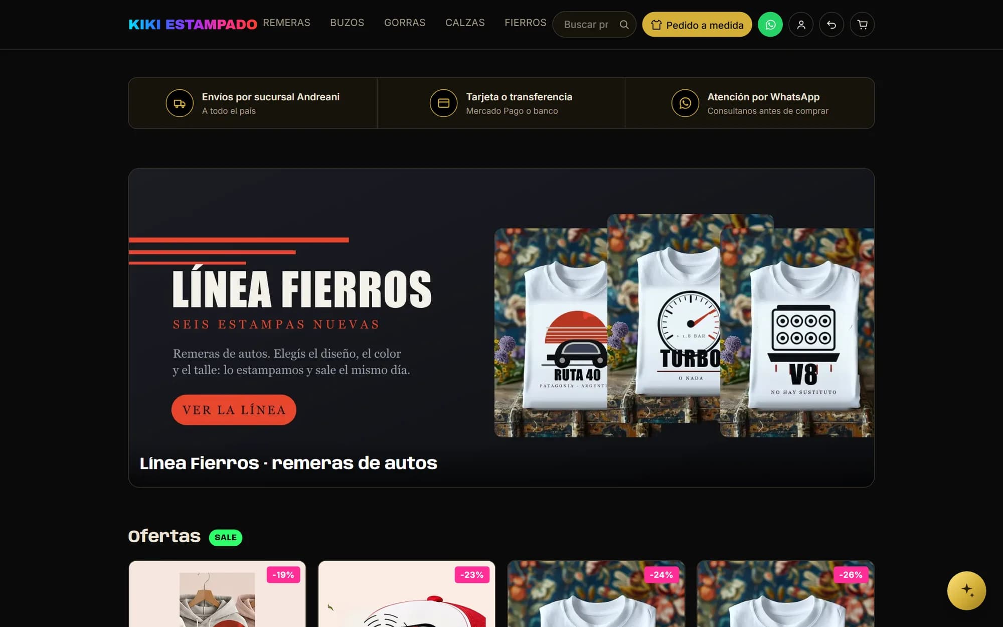
Kiki Estampado's home page: black background, gradient logo, search box on top and an ad for the car t-shirt line
Every screenshot in this walkthrough comes from a local copy of the store, loaded with invented products and orders. A client's sales and customers don't belong in anyone's portfolio.

Home page

The home page is a list of blocks, reordered with arrows

The shop window isn't written in code: it's a list of blocks the workshop assembles and reorders. A banner is a block, the deals are another, the new arrivals are another. So “the new line's ad first, then the deals, then another piece, and only then the new arrivals” gets written exactly like that, without asking anyone for anything. Each banner also picks how much room it takes — full width or half a page — and how tall it stands, because a wide graphic and a vertical photo don't sit well at the same proportion.
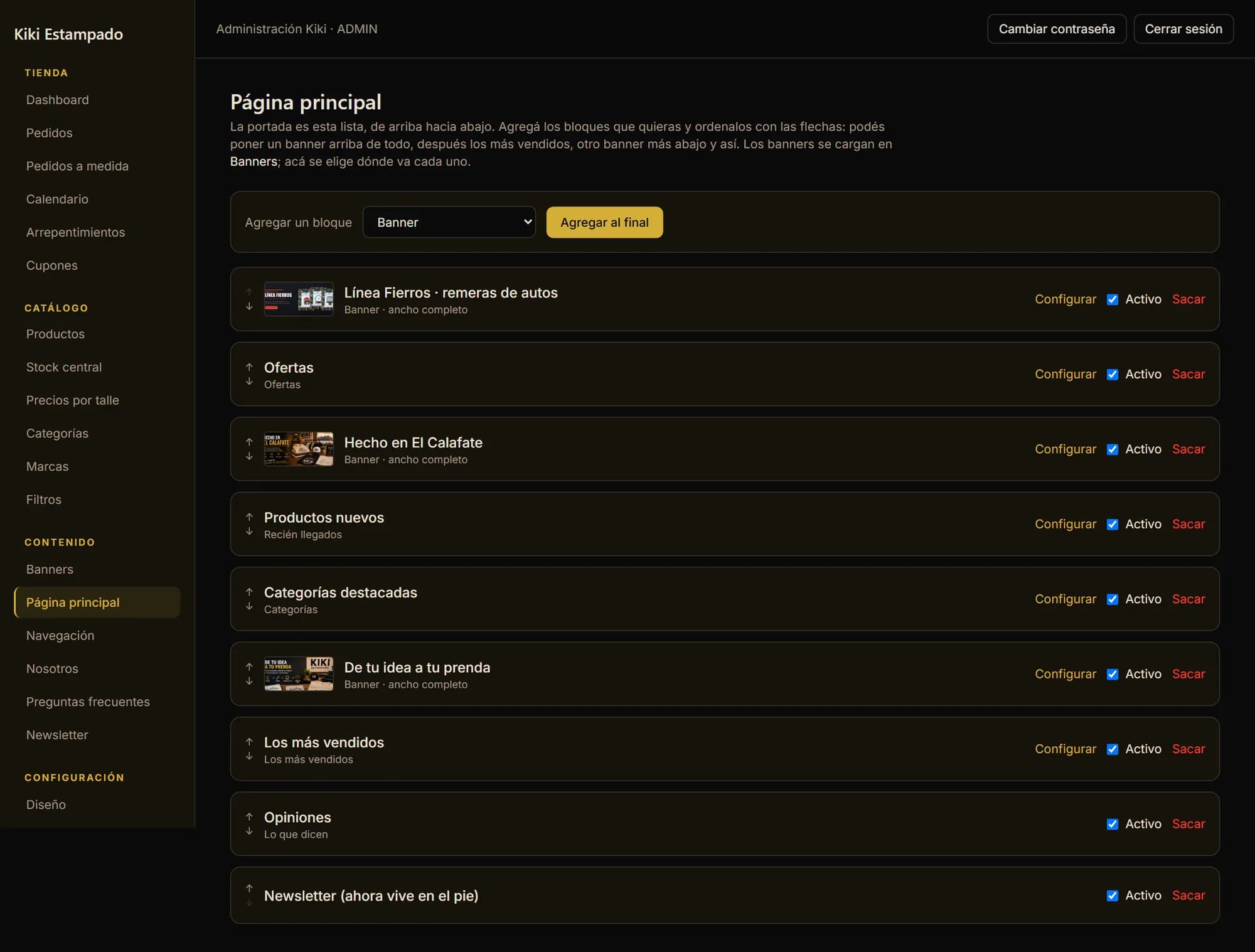
The panel's “Home page” screen: the nine blocks of the home page in a row, with arrows to move each one up and down
Blocks carrying a banner show their thumbnail and their name — “Línea Fierros”, “Hecho en El Calafate”, “De tu idea a tu prenda” — and say how much room they take. The “Active” checkbox switches a block off without removing it from the list, and the banner stays in the library to be used again next season.
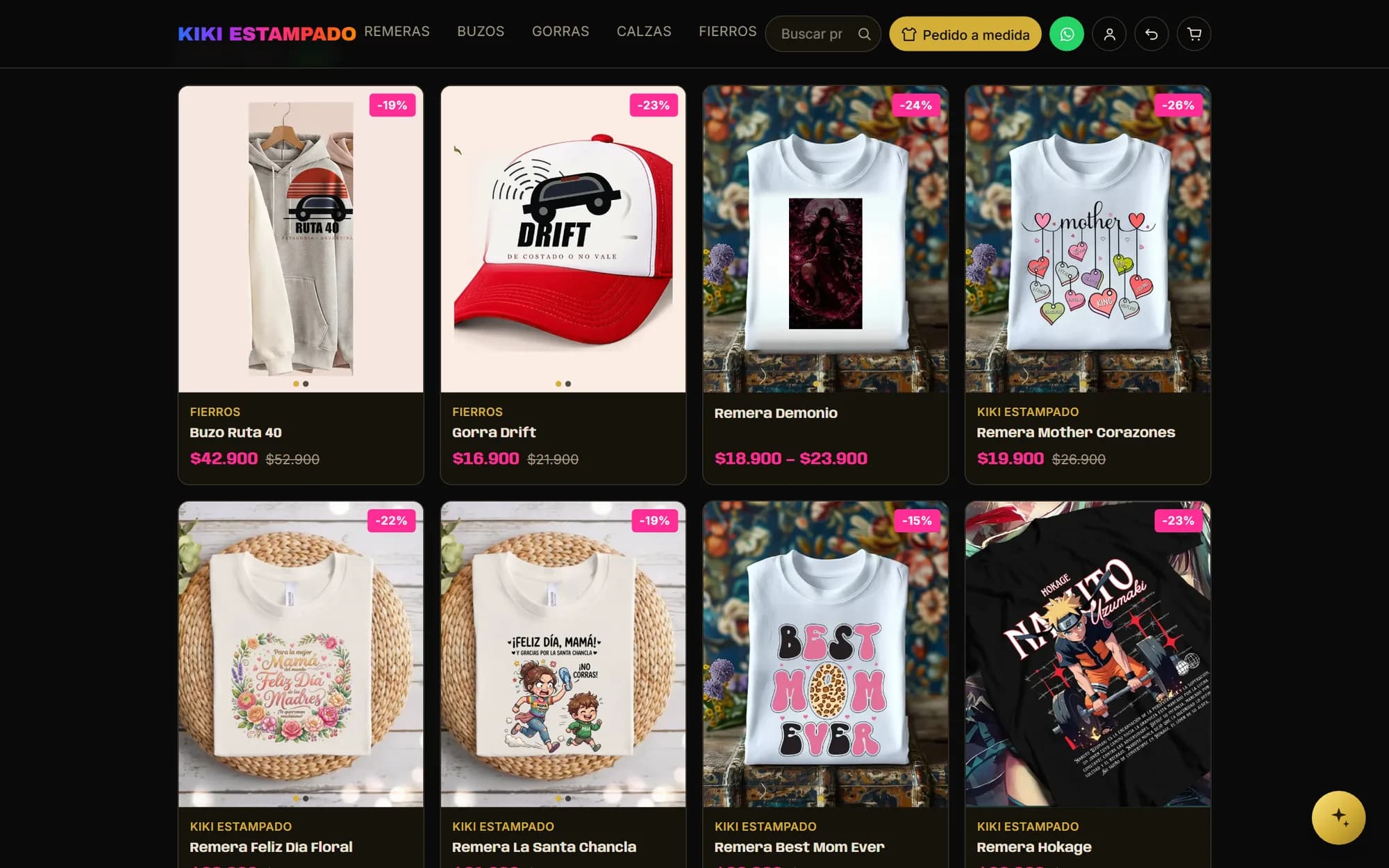
The home page's deals strip: eight products with the discount percentage stamped on the photo and the old price crossed out

Catalogue

Sixty-two products and a single price per size

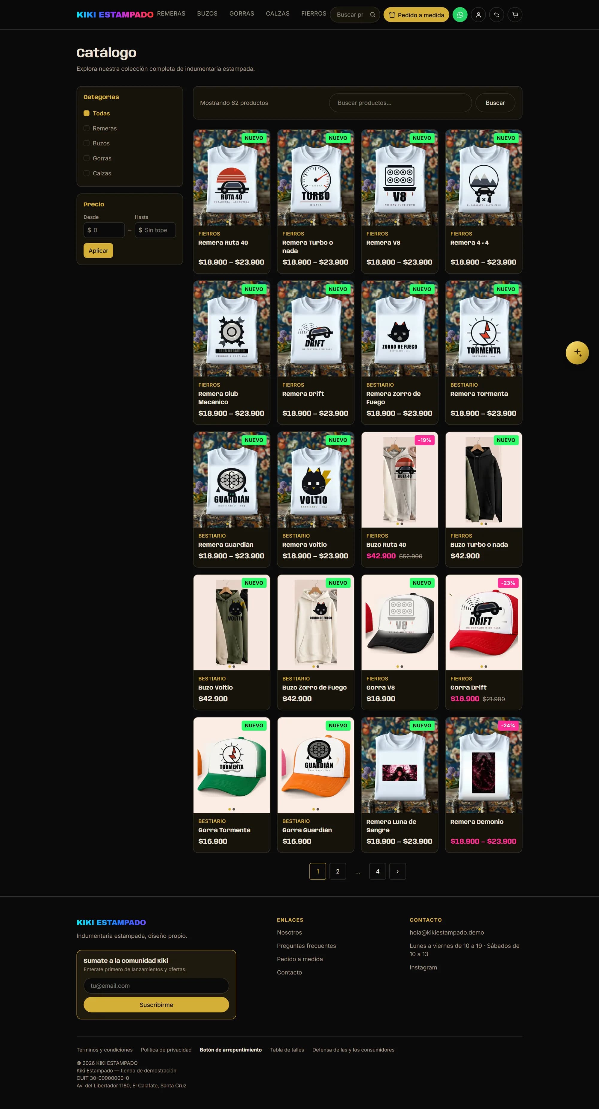
Categories, a price range and a search box, with the result count always in sight. The thing to look at is the price: printed t-shirts read “$18,900 – $23,900” instead of a single figure, because the price comes from the size and not from the design. An XXL costs more than an S across every print alike, so the catalogue shows the range and the product page shows the number once you've chosen.

Kiki's catalogue with category and price filters on the left and the product grid on the right
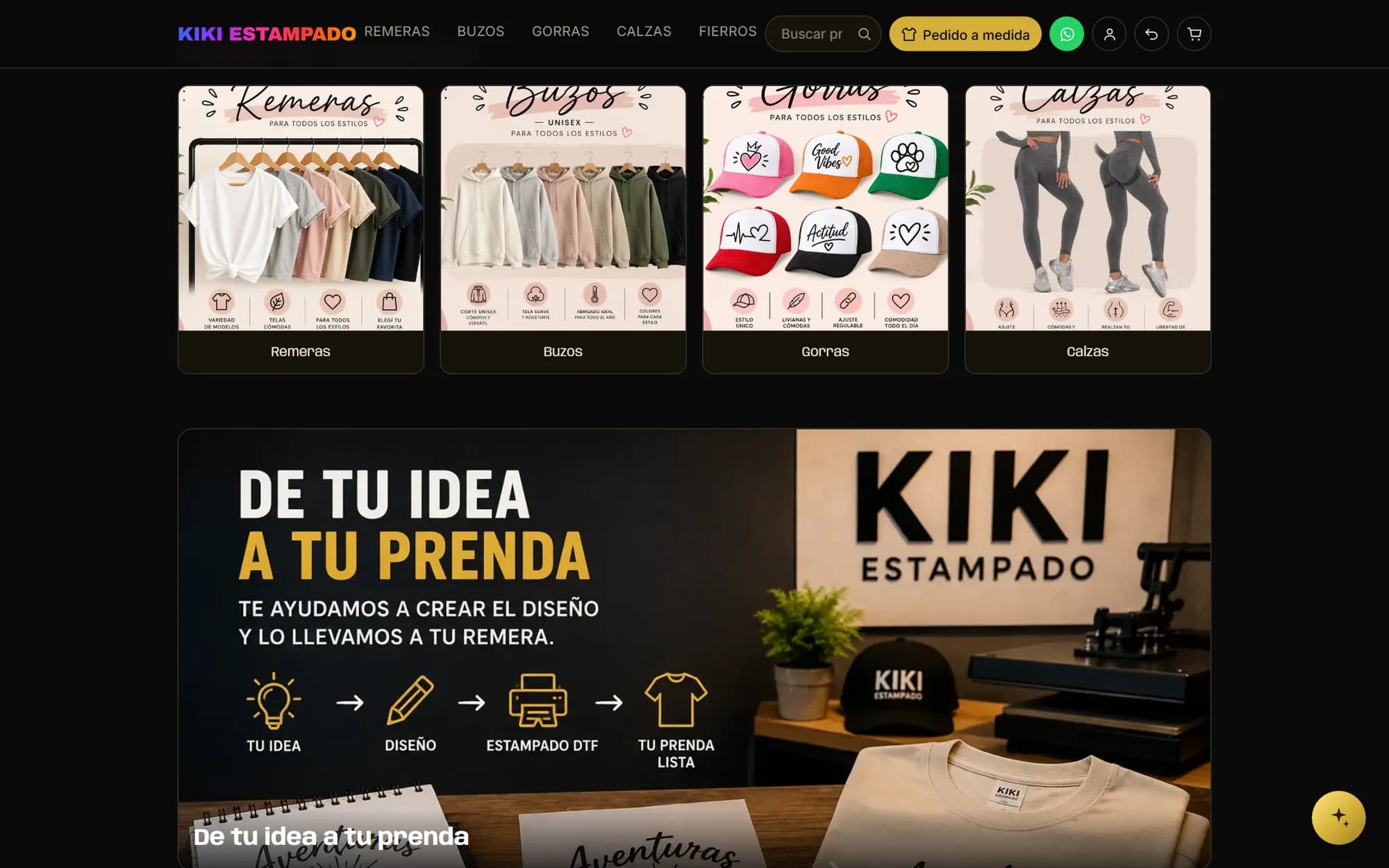
The home page's featured categories strip, one photo per category
The four categories come from the ones actually loaded, not from a hand-written list. Adding a fifth means creating it in the panel and ticking it here.

Product page

Size and colour are chosen separately

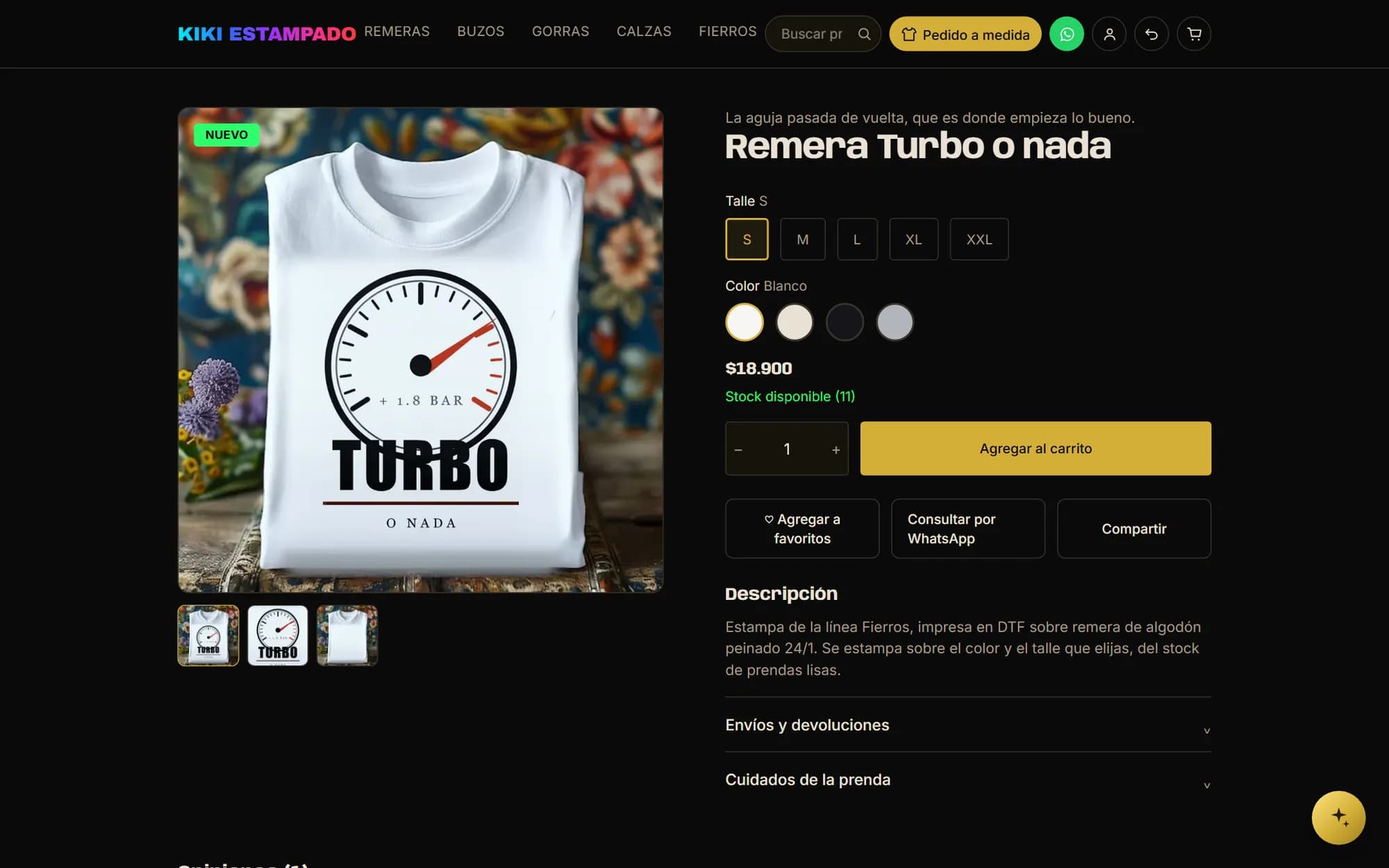
Five sizes and four colours aren't twenty buttons: they're five and four, and the store crosses what you picked. The price changes when you tap a size, and the stock says how many are left of that exact combination — “In stock (11)”, not a generic “available”. That number comes from the pile of blank garments, not from an inventory owned by this print. Below, the reviews and related products, which are what keeps a visit from ending at a single garment.

The Turbo t-shirt's page: size selector, colour swatches, price, available stock and the add-to-cart button
The three photos underneath are the same garment: the product, a close-up of the print, and the blank t-shirt it gets printed on. The third one answers the question that arrives over WhatsApp: “what colour is the shirt?”.

Central stock

One single pile of blank garments for every design

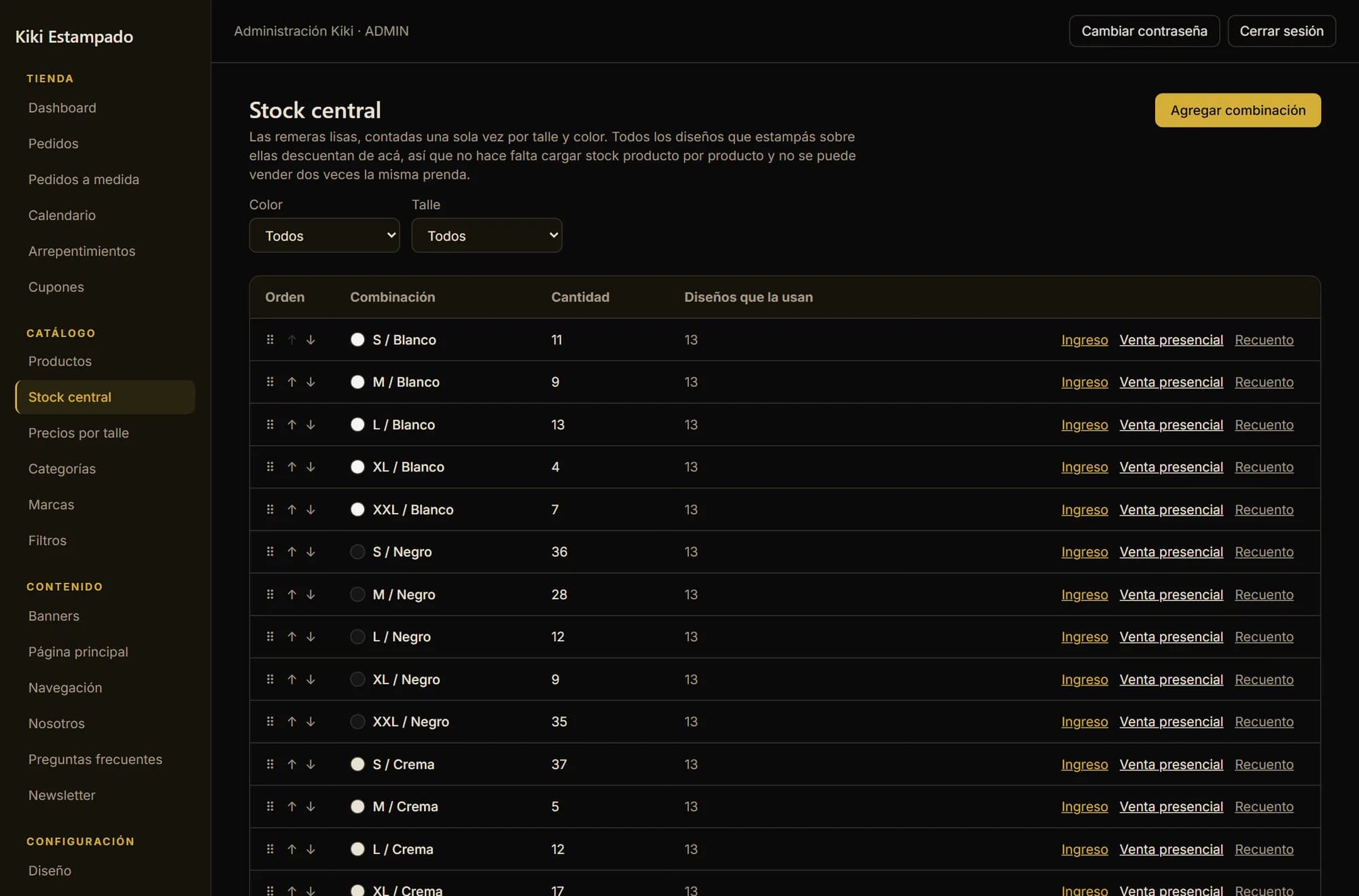
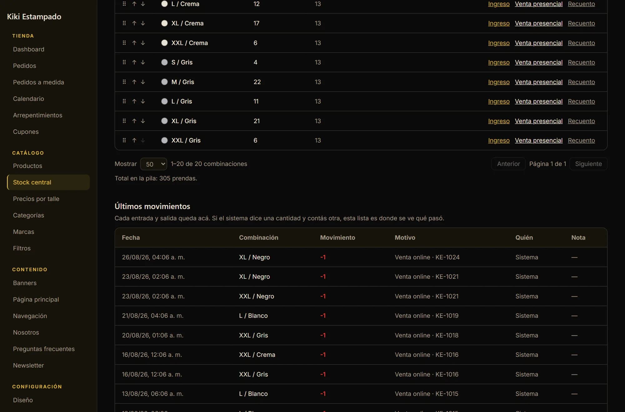
This is the heart of the store. Kiki doesn't keep sixty-two inventories: it keeps a pile of blank garments counted once per size and colour — twenty combinations, 305 garments — and thirteen designs printed onto that same pile. Selling a size-L white Turbo shirt and selling a size-L white Ruta 40 draw down the same row, because in the workshop they are the same garment until it reaches the heat press. Loading stock product by product was the alternative, and it meant promising the same shirt thirteen times over.

The central stock screen: the size-and-colour combinations, with their quantity and how many designs use each one
The “Designs using it” column reads thirteen on every row: those are the thirteen prints made on blank garments. Each combination also has its own stock-in, over-the-counter sale and manual recount, because the shop floor draws down too.
The latest stock movements, with date, combination, quantity, reason, who did it and the order number that caused it
“Online sale · KE-1024”. Every movement in and out is recorded with its reason and its order number. It's the screen you open when the system says one number and the workshop counts another.

Prices

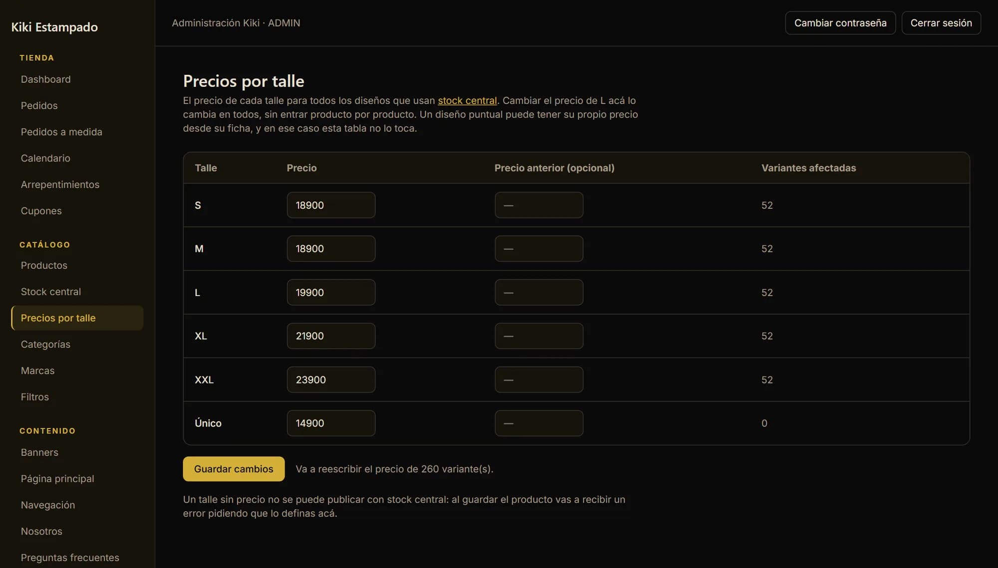
Raising the XL price is one box

If the price depends on the size and not on the design, the price table has to be a single one too. Changing “L” here changes it across all thirteen prints at once, and the panel says how many variants it's about to rewrite before you hit save. One particular design can carry its own price from its own page, and in that case this table doesn't override it — which is what you need to put a print on sale without pulling it out of the general system.

The price-per-size table: six sizes, each one's price, an optional previous price, and how many variants it affects
“Variants affected: 52” on every row, and beside the button the warning that saving rewrites 260 prices. A number like that is better seen before than after.

Loading a product

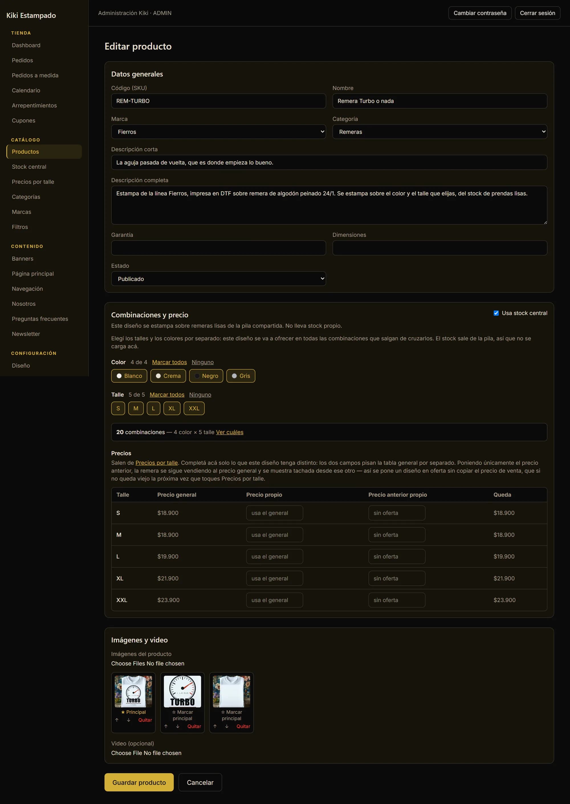
A new design is two lists and no variant spreadsheet

Loading a new print isn't loading twenty rows. You tick the colours, you tick the sizes, and the twenty combinations come from crossing them: the panel counts them out loud and lets you see them if you need to. Prices are inherited from the general table and the boxes sit empty saying they use the general price, which is how you show there's nothing to fill in there. Stock doesn't even appear: it comes from the pile.

  1. 01

    Tick the colours

    Each with its swatch beside it. Whatever isn't ticked isn't offered.

  2. 02

    Tick the sizes

    The same five as always, or fewer if that print doesn't fit on an S.

  3. 03

    Let them cross

    The twenty combinations build themselves and the panel says how many there are before saving.

  4. 04

    Leave price and stock alone

    The price comes from the per-size table and the stock from the pile. You only fill in whatever this design does differently.

The editor of a product using central stock: general details, the ticked colours and sizes, the combination count and the inherited price table

Checkout

From the cart to the branch, with no surprises in between

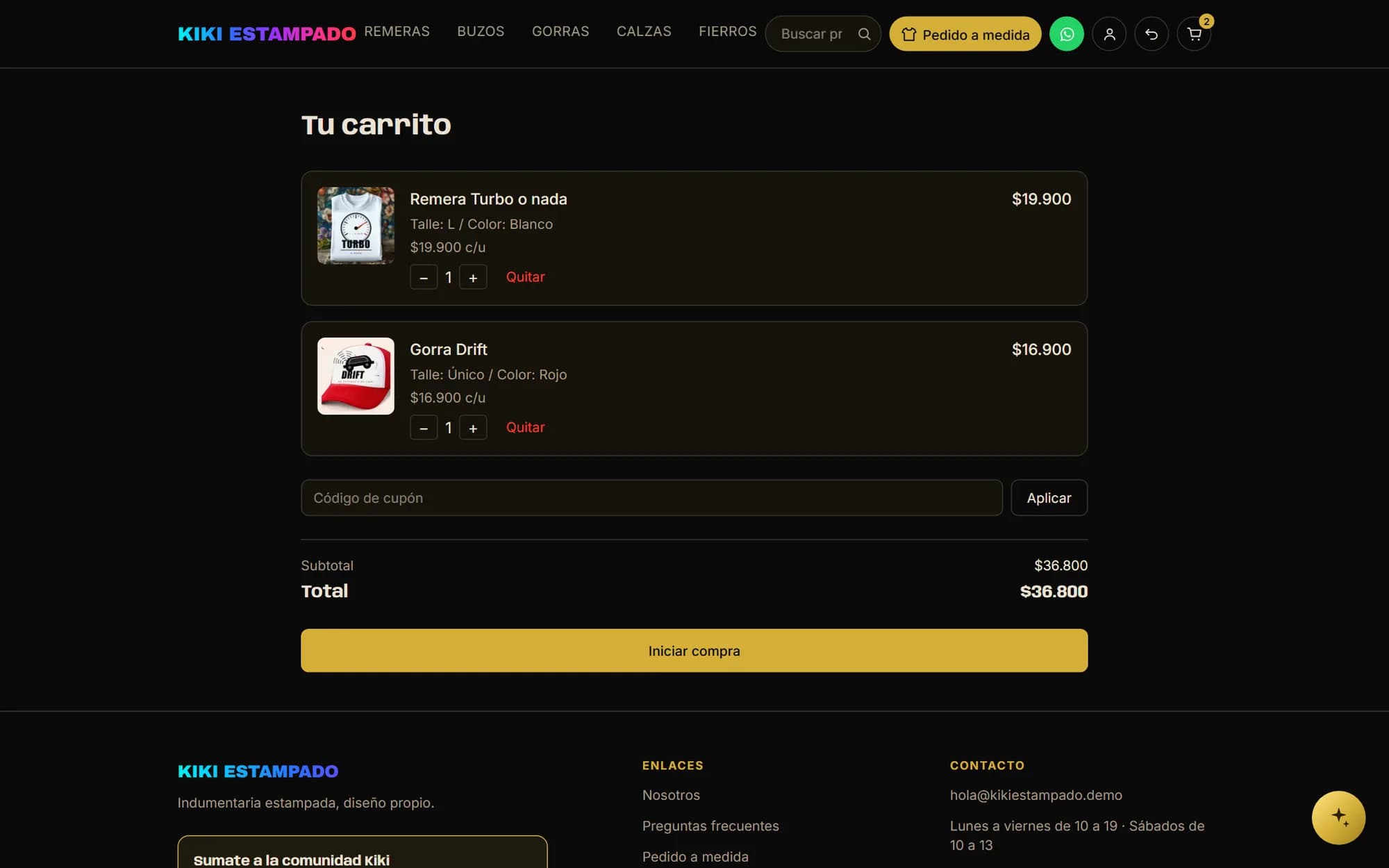
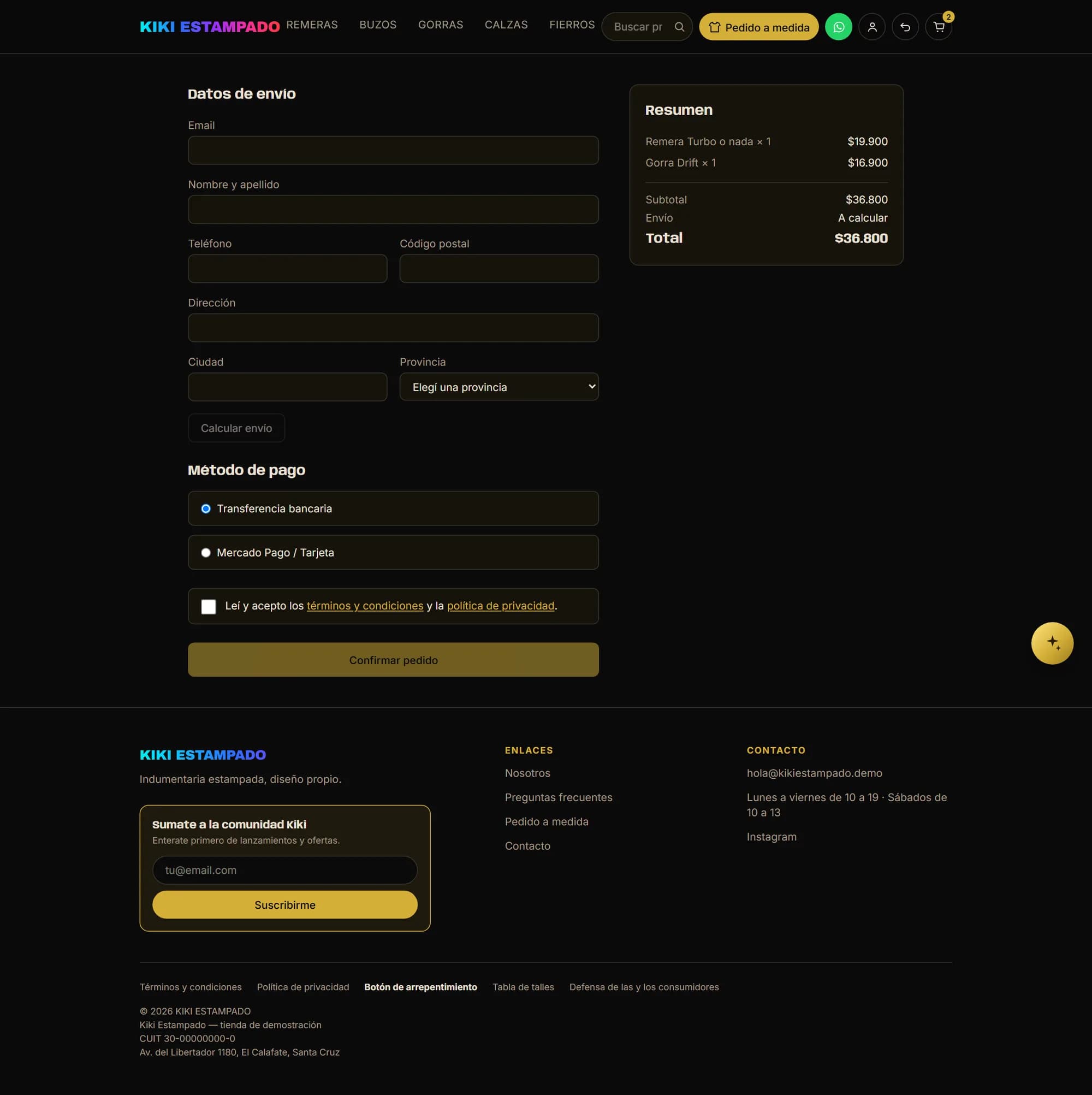
Editable quantity, a discount coupon, subtotal and total before anything starts: nothing appears after you've entered your details. Shipping is worked out from the postcode, payment goes through Mercado Pago or a bank transfer — and in that case the bank details come from the panel, not from an environment variable — and you have to tick that you've read the terms. The footer carries terms, privacy, the cancellation button, the size chart, the consumer-protection link and who is selling: legal name, tax number and address.

The cart with two products, a coupon field, subtotal and total, and the start-purchase button
Checkout with shipping details, postcode-based shipping calculation, the two payment methods and the terms checkbox
The terms checkbox isn't a formality: what gets stored is when it was accepted and a fingerprint of the text published that day. The terms are edited from the panel, so without that fingerprint there'd be no way to know what anyone actually agreed to.

Orders

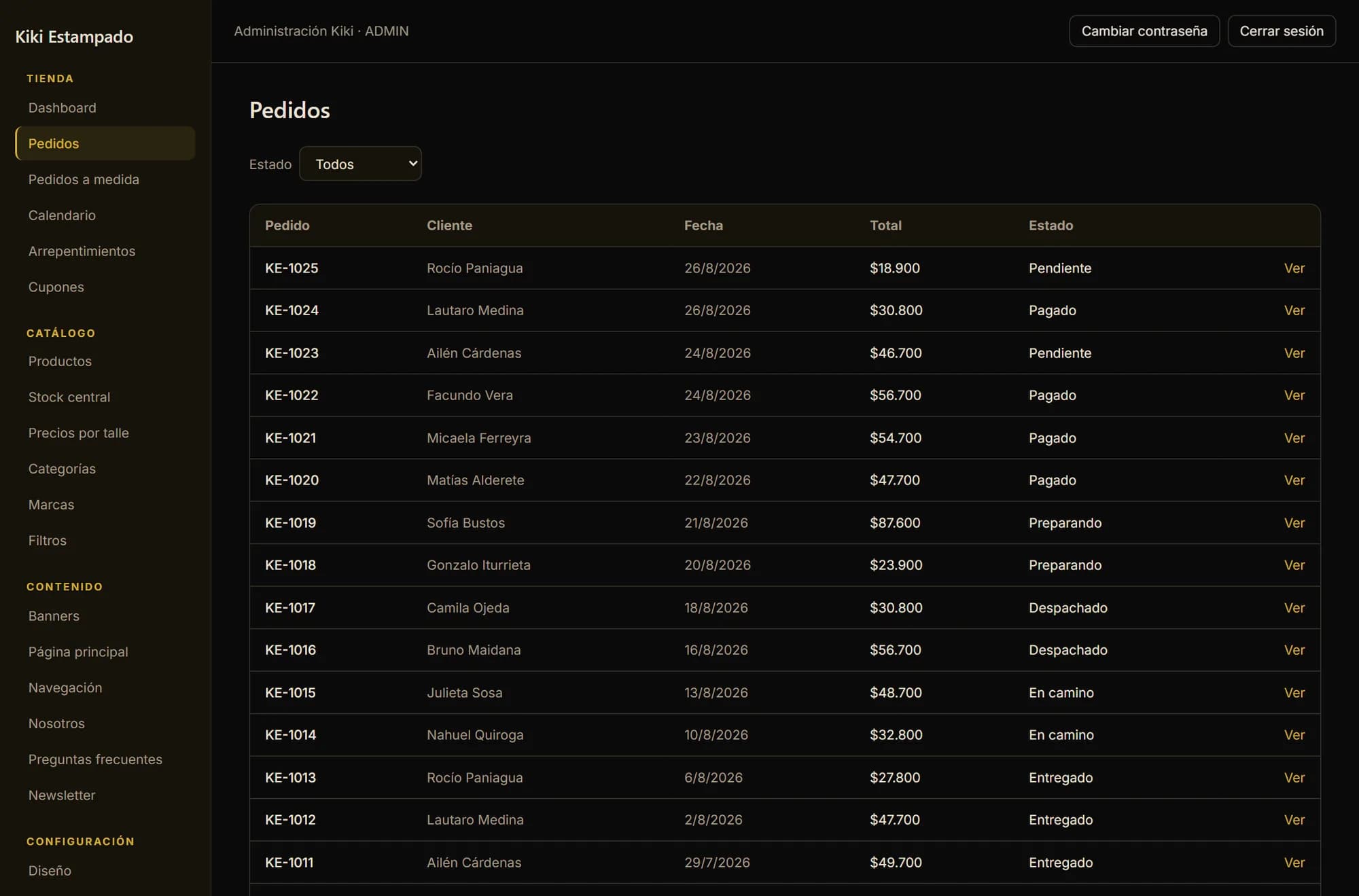
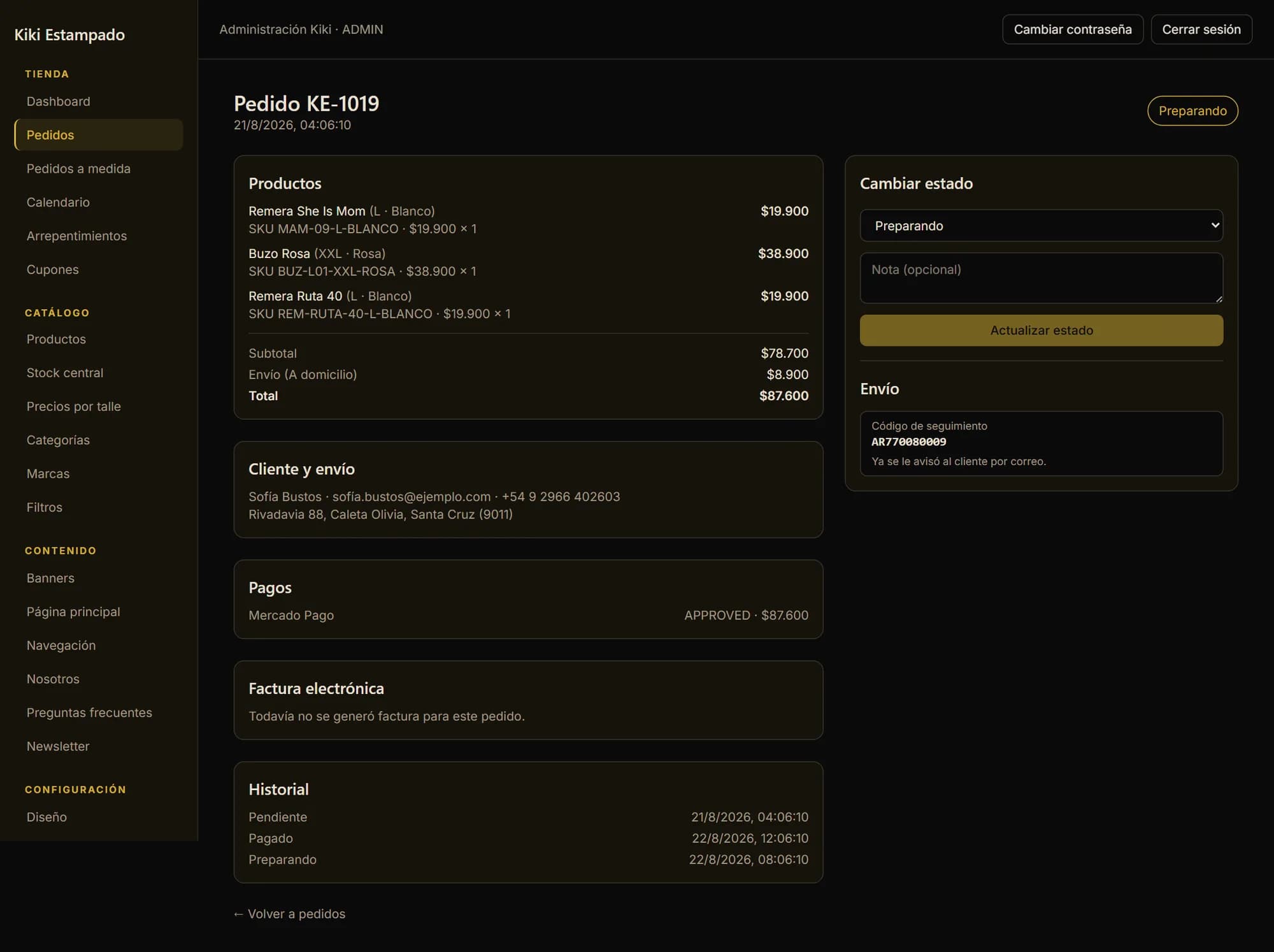
An order is followed by its status, not by memory

Pending, paid, preparing, dispatched, in transit, delivered. Every change keeps its date, so the history answers “when did we ship it?” without anyone having to remember. Inside each order is what sold, with size and code, the address, the payment with its status, the transfer receipt the buyer uploaded and the tracking number. Stock comes off when the order is placed, not when it's paid: if the payment never lands, the garment goes back to the pile.

The order list with number, customer, date, total and status
An order opened: the products with their size and code, the customer, the shipping, the approved payment and the status history

Custom orders

The enquiry that exists before the product does

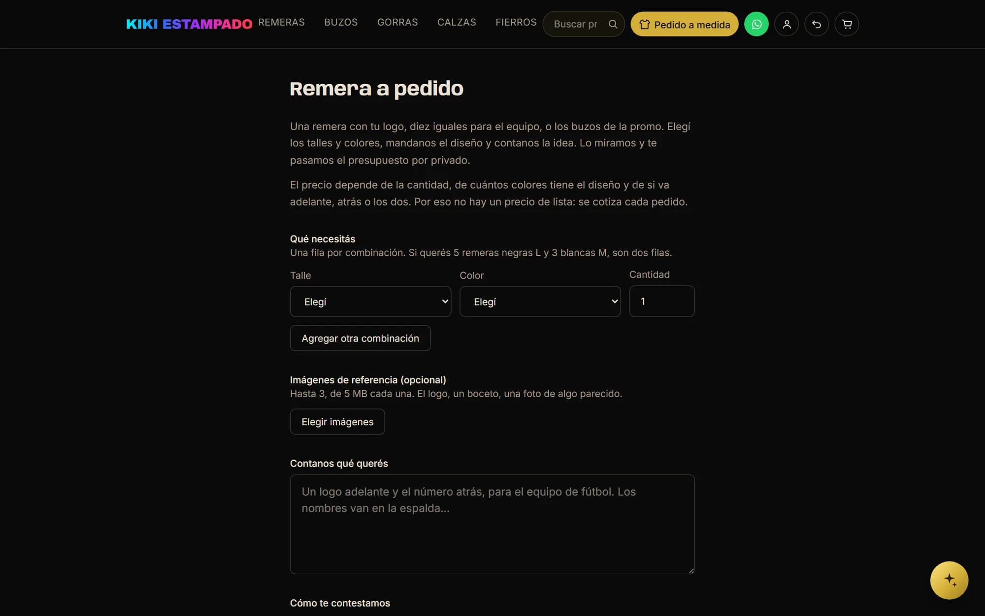
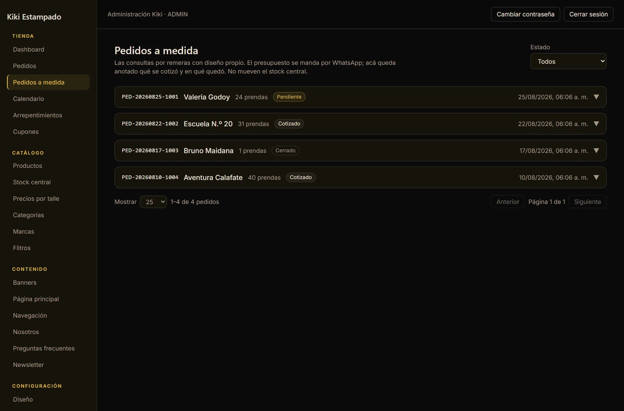
Half of what a print shop does isn't in the catalogue: it's twenty-four shirts for a hiking group, thirty-one graduation hoodies, forty caps for a tour agency. That used to live in WhatsApp. Now it arrives through a form that asks for what's needed to quote — one row per combination of size, colour and quantity, the idea in writing and up to three reference images — and gets filed with a code you can say over the phone, a status and a note of what was quoted. They don't touch central stock: those are garments nobody has bought yet.

The custom-order form with rows for size, colour and quantity, the image upload and the field for describing the idea
The text at the top says why this can't be just another product: the price depends on the quantity, on how many colours the design has and on whether it goes on the front, the back or both. That's why there's no list price and every order gets quoted.
The custom-order list in the panel, each with its code, customer, garment count and status

Calendar

“How did this month go?”, answered without exporting anything

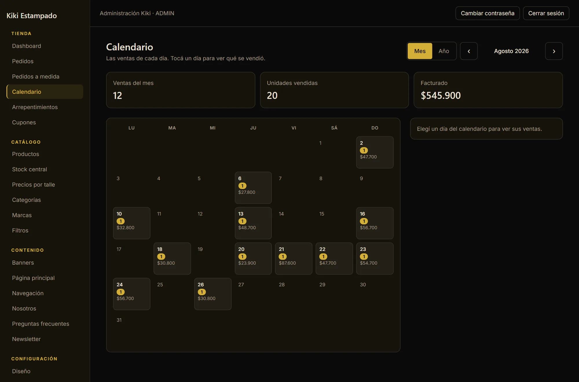
That used to be answered by opening the order list and adding up one by one, or it wasn't answered at all. The calendar shows the whole month at once: how many sales each day, how much was invoiced, and which days sold nothing. Tapping a day opens what sold, with each variant's size and code. The empty days are information too — a calendar where everything is full doesn't look like any real shop.

The panel's sales calendar: the month grid with each day's sale count and revenue
At the top, the month closed in three figures: sales, units and revenue. The same calendar has a year view that puts all twelve months together, which is what an order list can't do.

The rest of the store

All the words, and the colours too

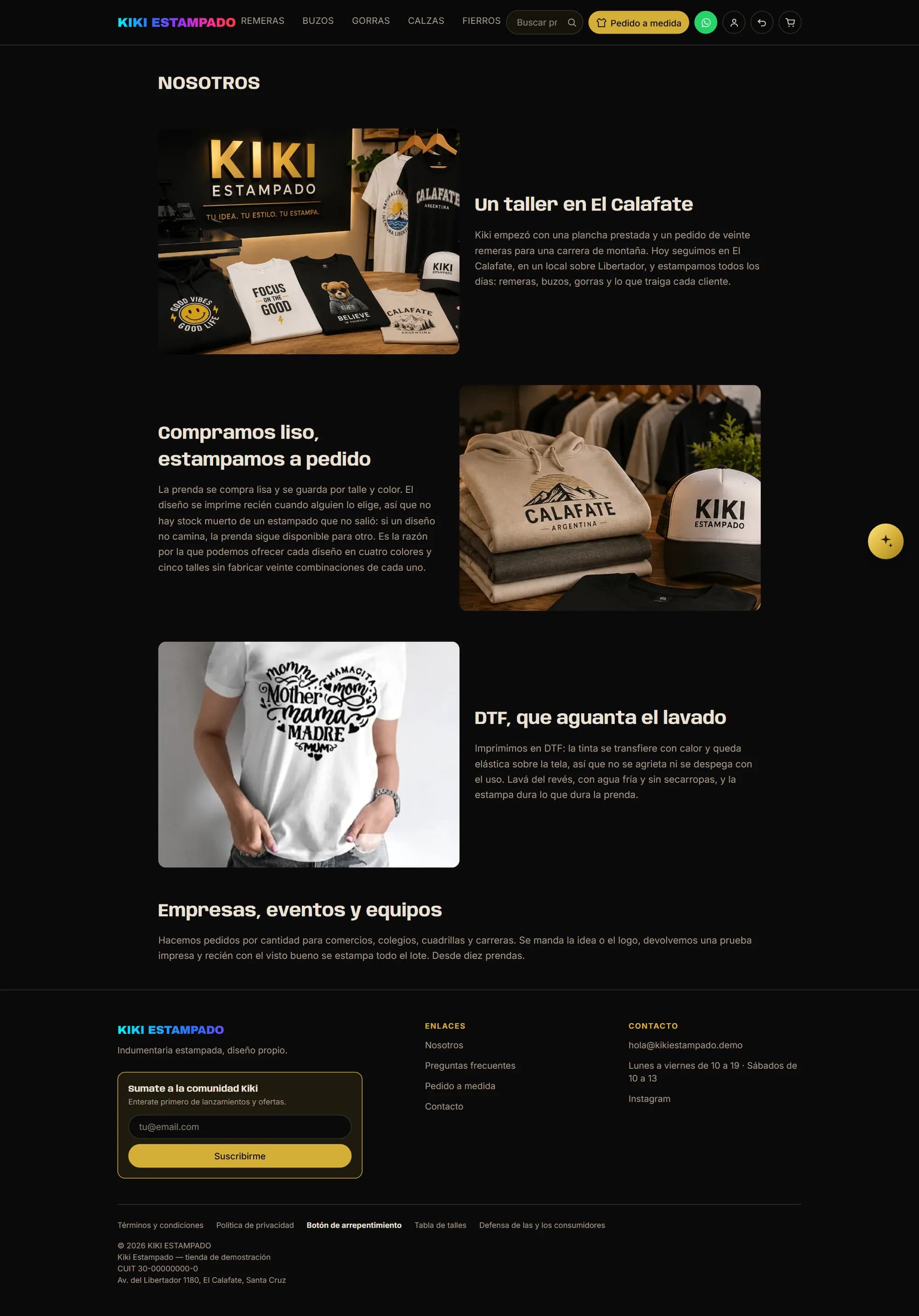
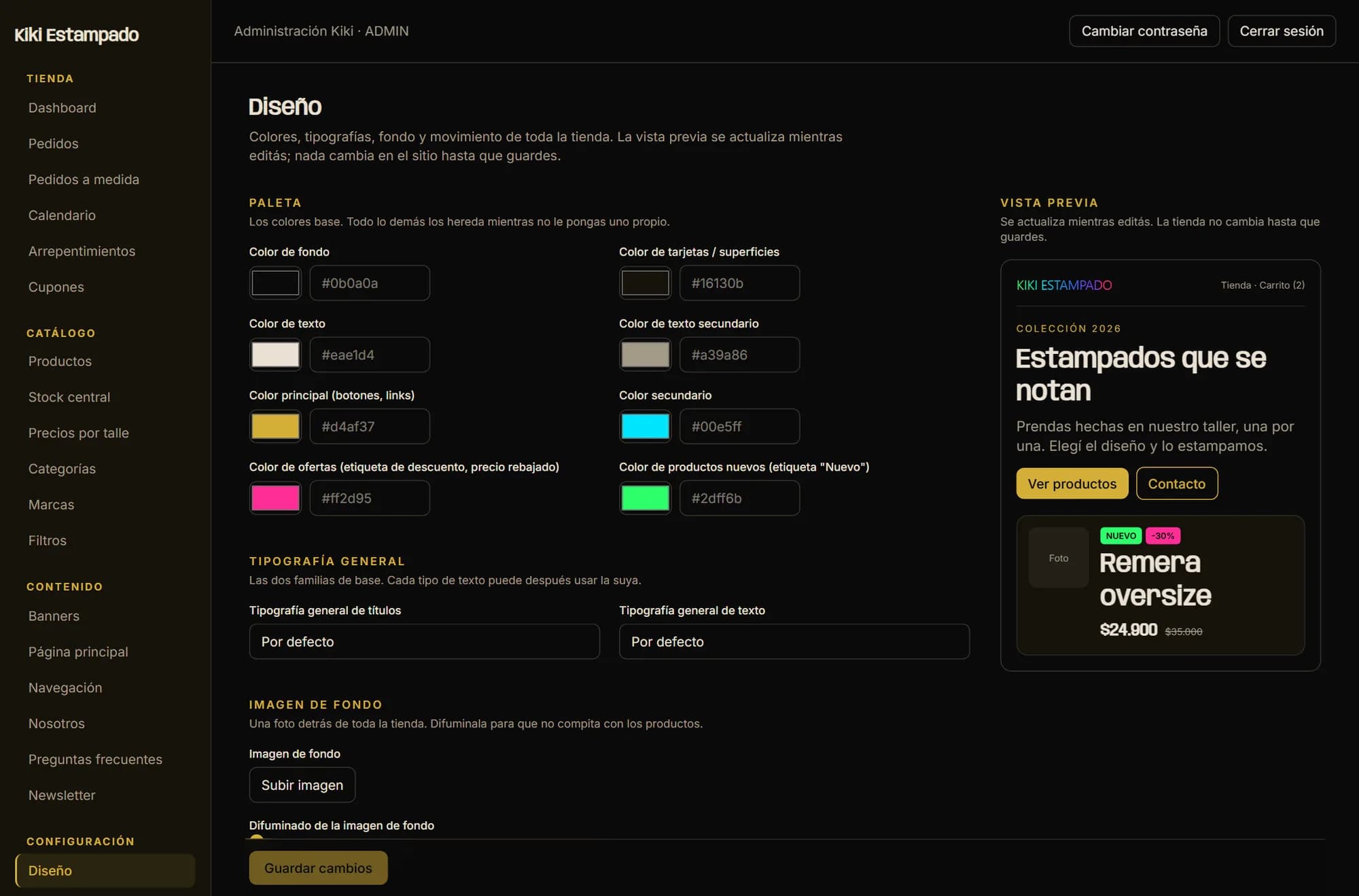
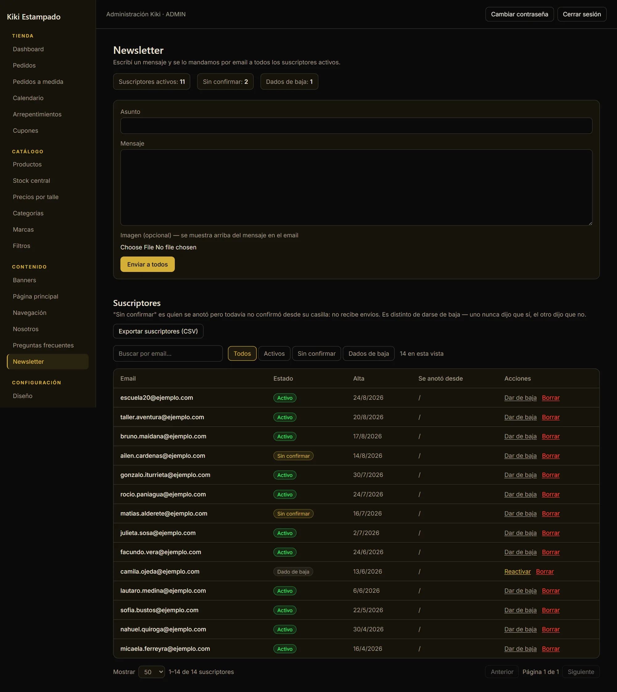
Not a word of the store is written in code: the “About” page is assembled from photo and text blocks, the FAQ is added one question at a time, the top and footer menus are edited, and so are the terms, the privacy policy and the size chart. The design goes the same way: the full palette — background, text, buttons, the sale tag — with a preview that updates as you edit and doesn't touch the store until you hit save. And the newsletter records when each person signed up, from where, and whether they confirmed from their own inbox, which is the only thing you can show if somebody claims they never subscribed.

The store's “About” page, with four blocks alternating photo and text
The panel's design editor: colour fields on the left and the store preview on the right
The newsletter screen: the message to send on top and below it the subscriber list with status and signup date
The three states — confirmed, unconfirmed and unsubscribed — exist separately on purpose. “Unconfirmed” is someone who typed their address and hasn't verified it from their own inbox yet, and until then they receive nothing.

On a phone

A store that fits in one hand

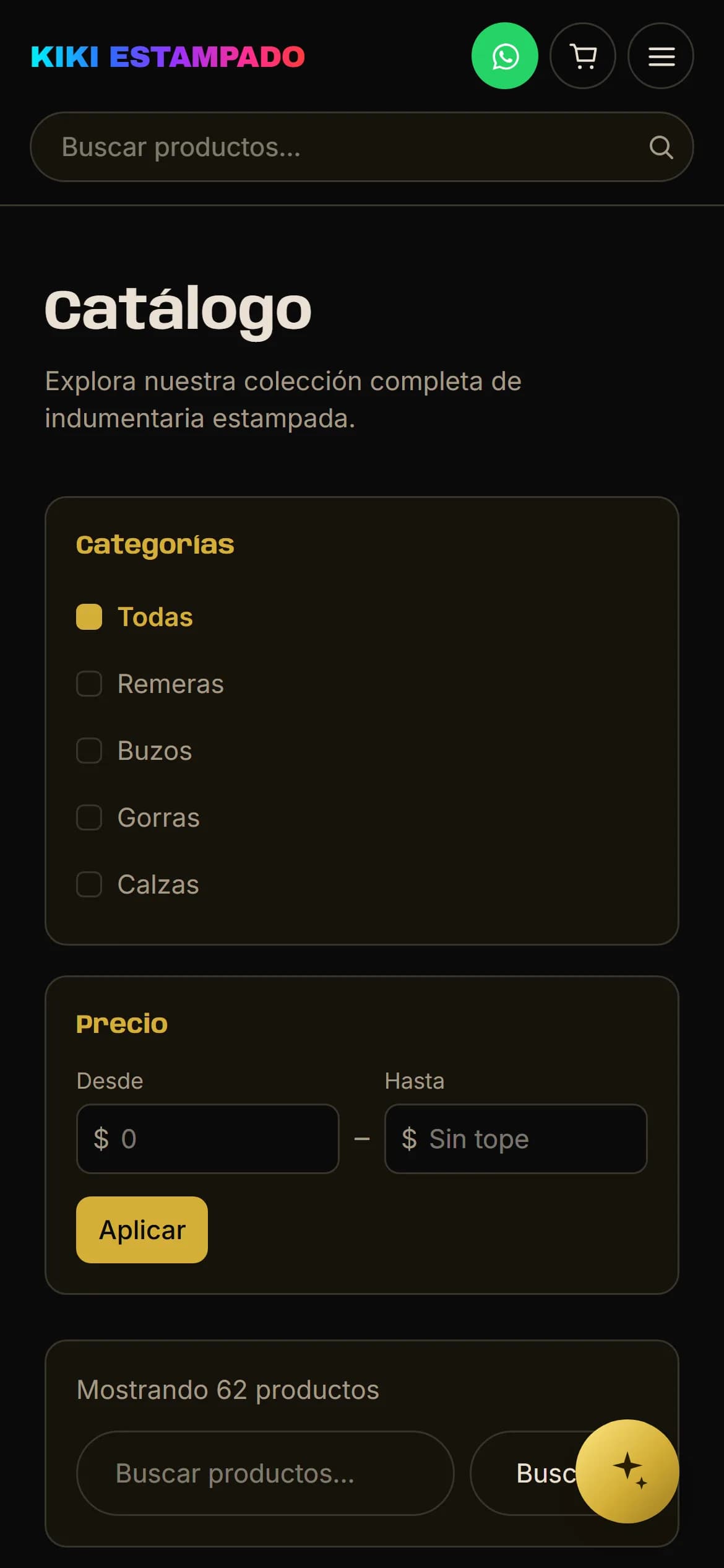
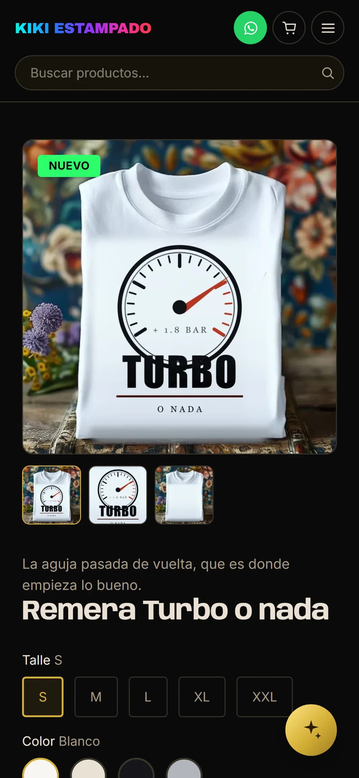
The same catalogue, the same filters and the same product page, rearranged for a narrow screen: the menu folds away, the search box moves to a row of its own and the filters stack above the grid. No cut-down version — there are no products you can only see from a desktop.

Kiki Estampado's home page on a phone
Kiki Estampado's catalogue on a phone, with the filters above the grid
A product page on a phone, with the size and colour selector

Want something like this for yours?

None of these sites was built from a template. Tell me what you sell and what you're fighting with today, and we'll see what can be done.