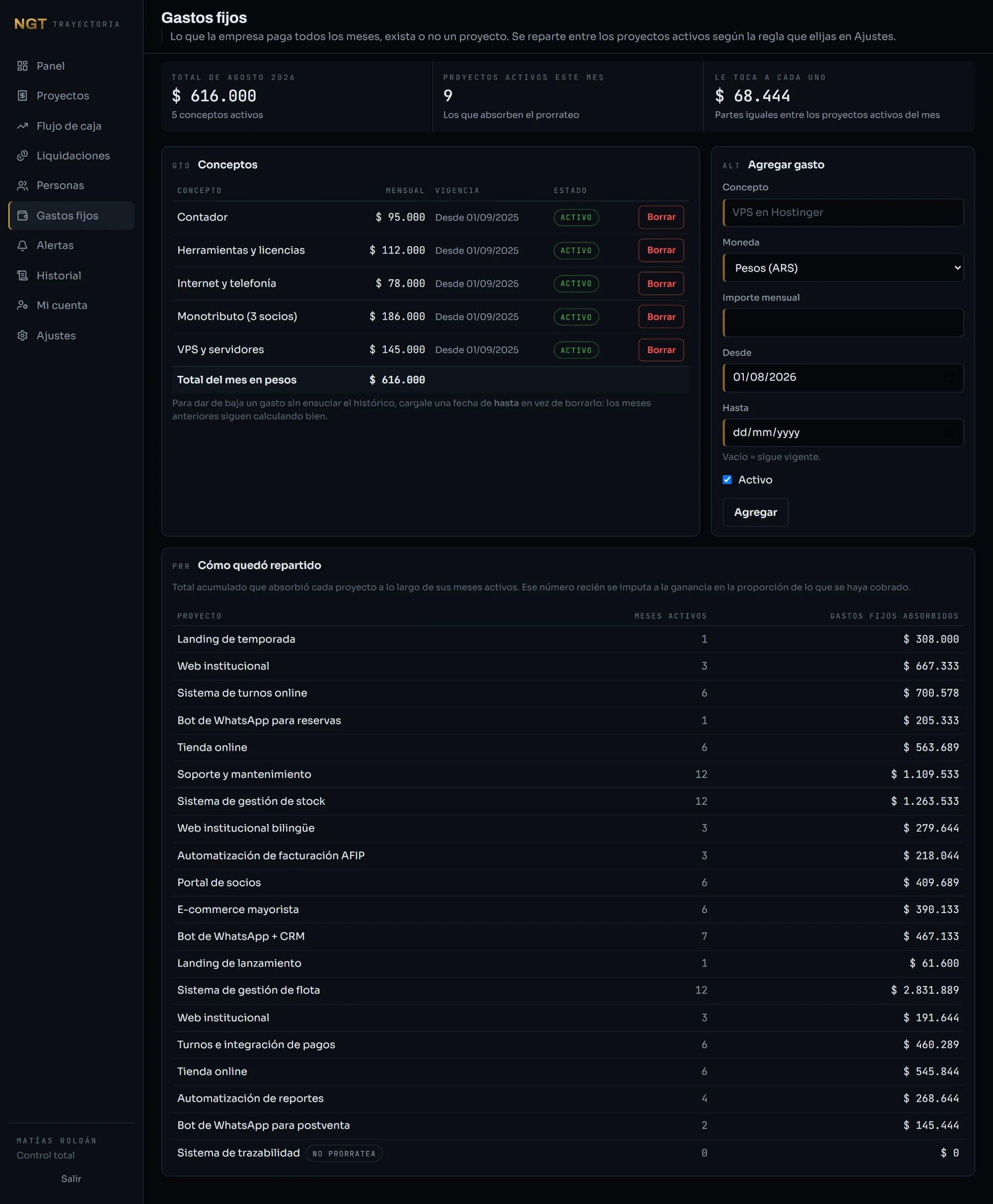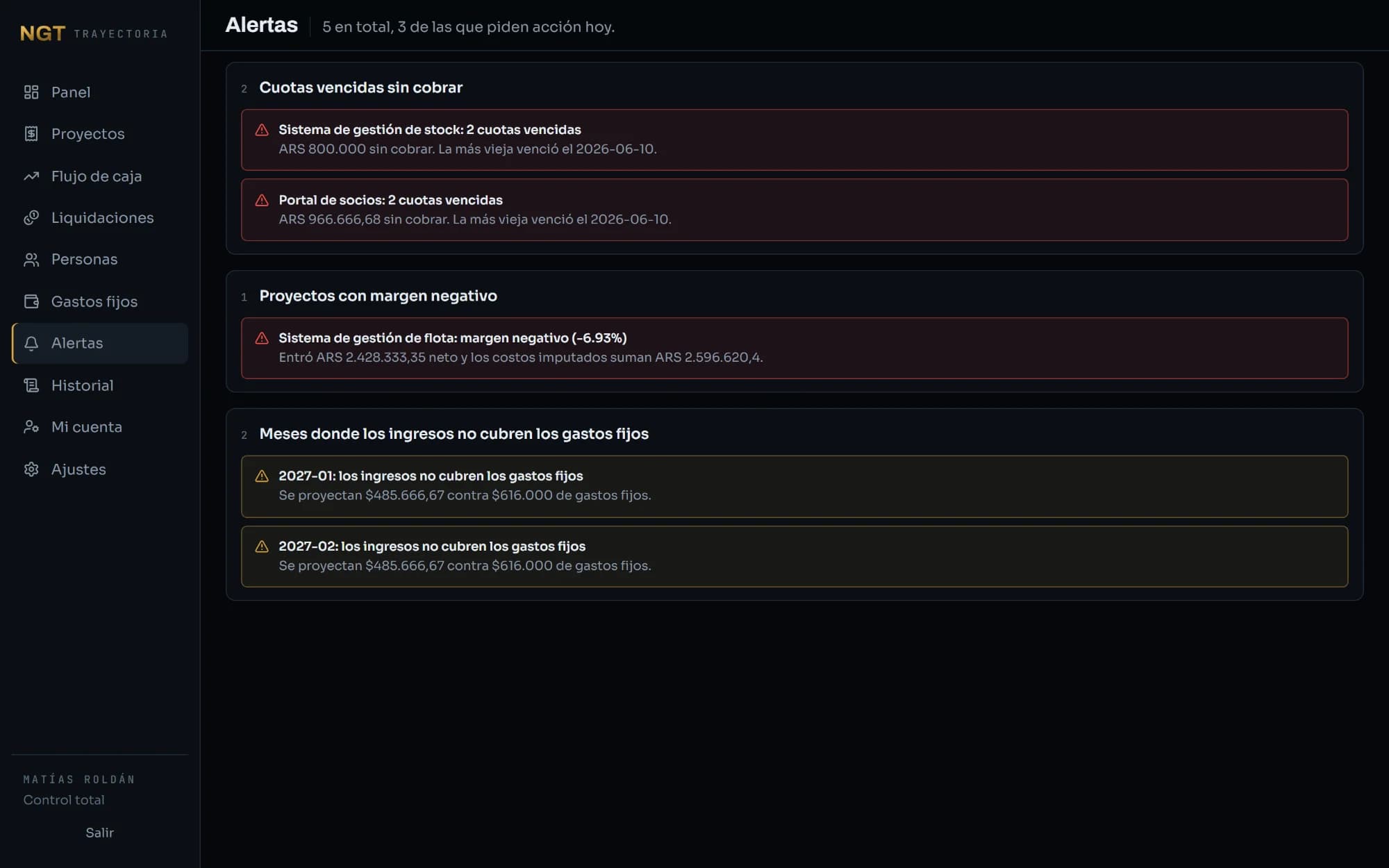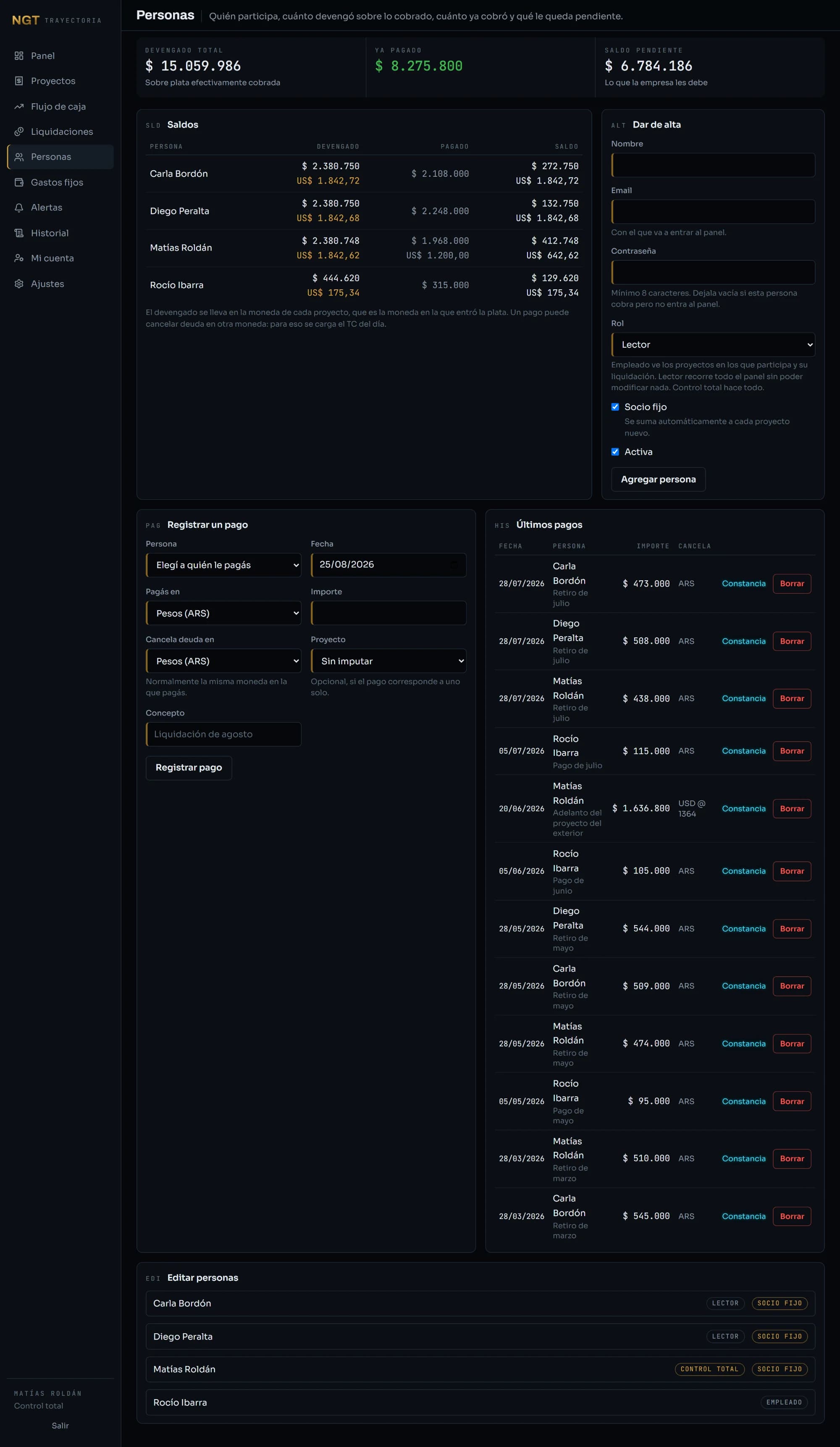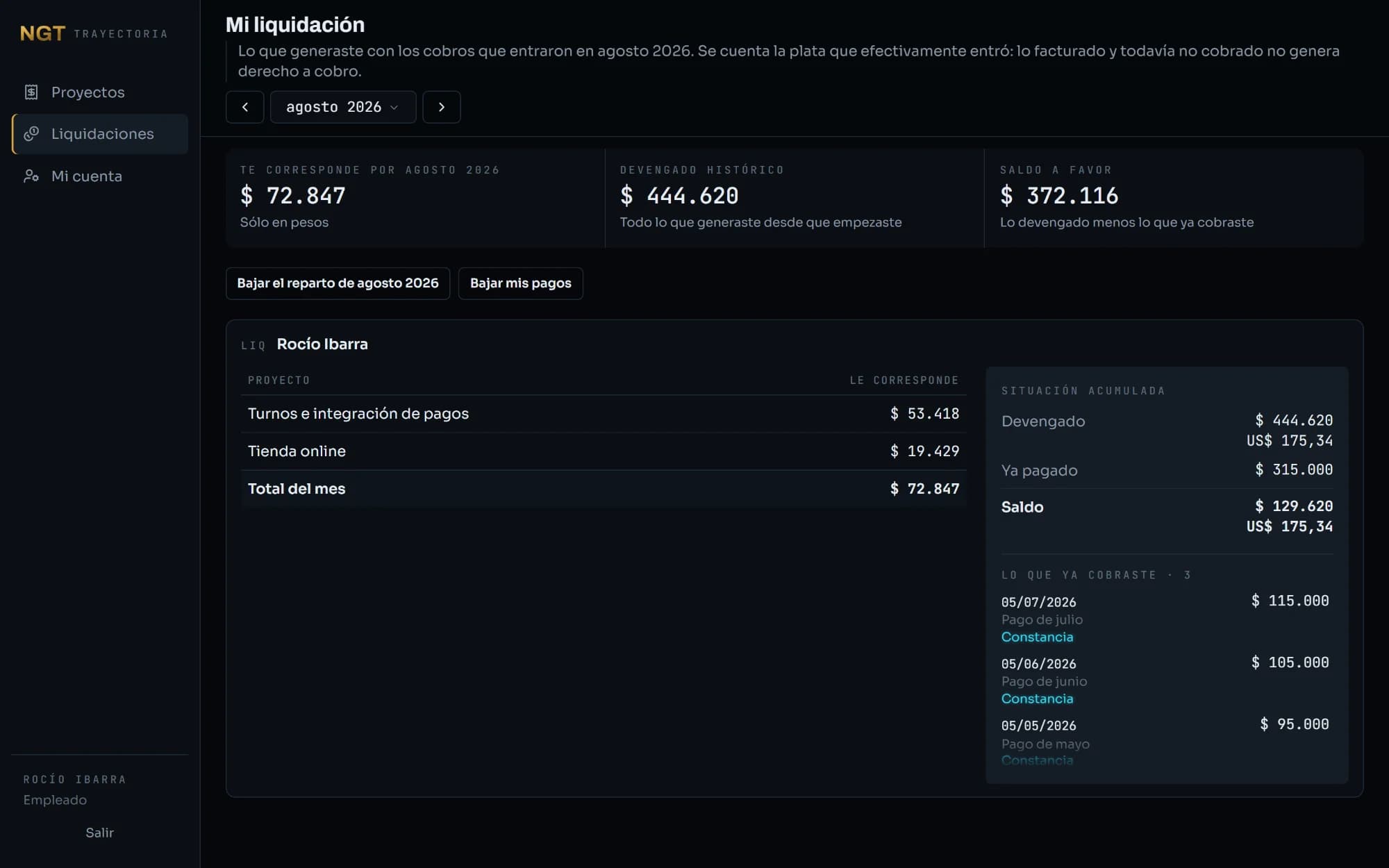
Dashboard
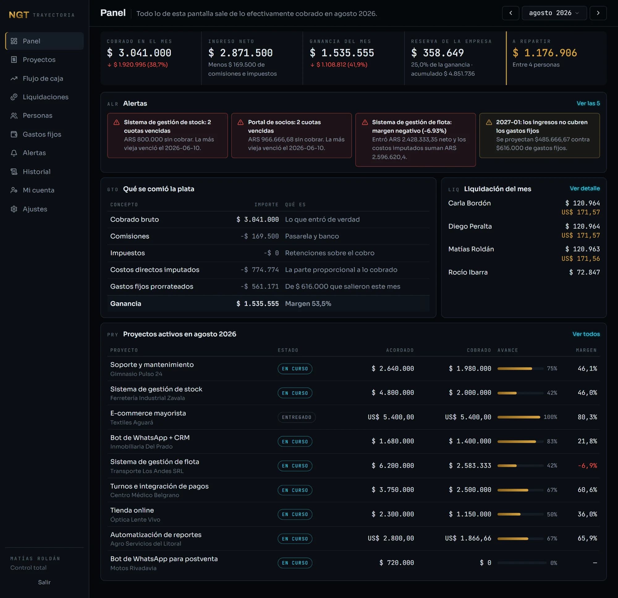
Five figures, and none of them needs interpreting
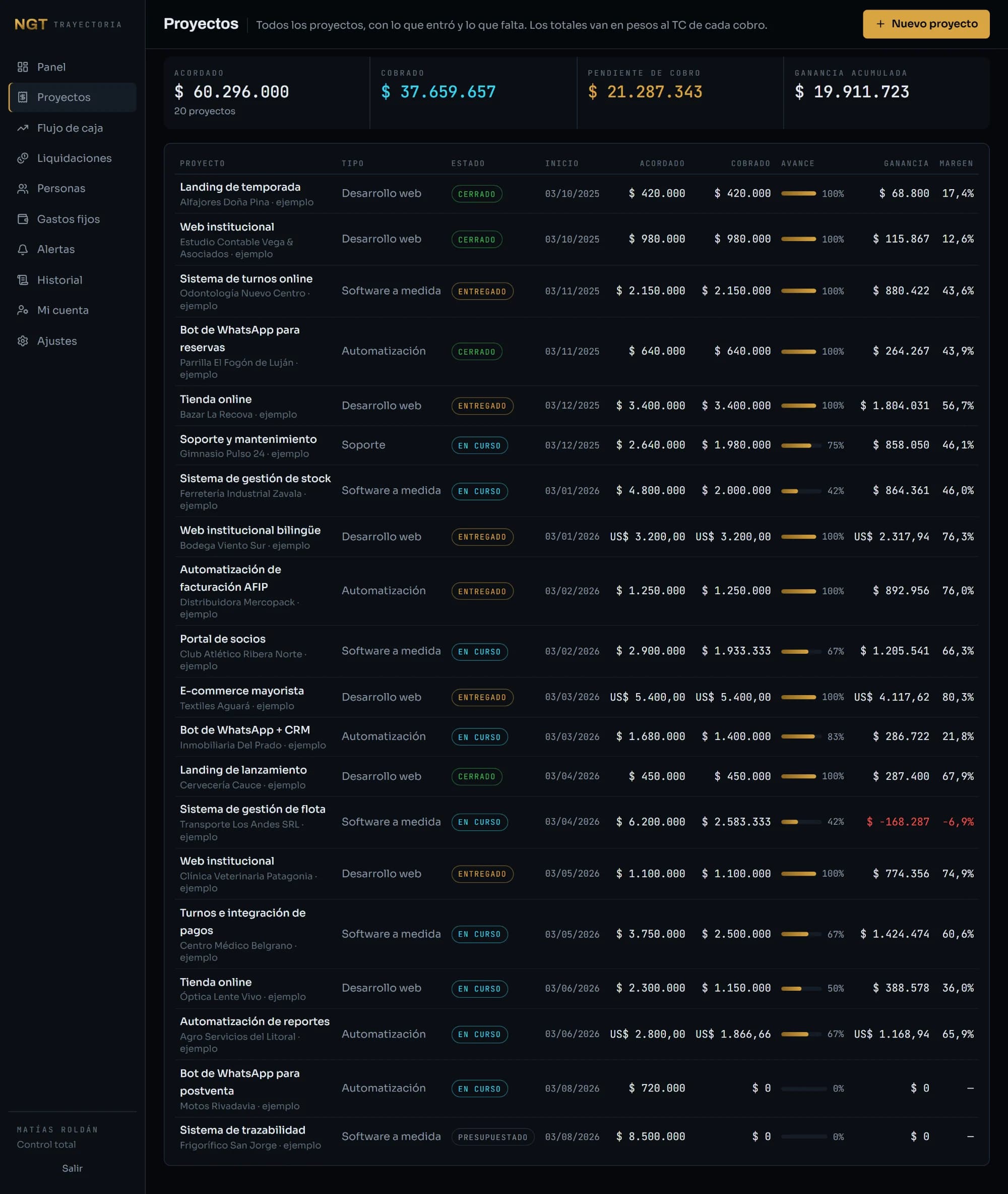
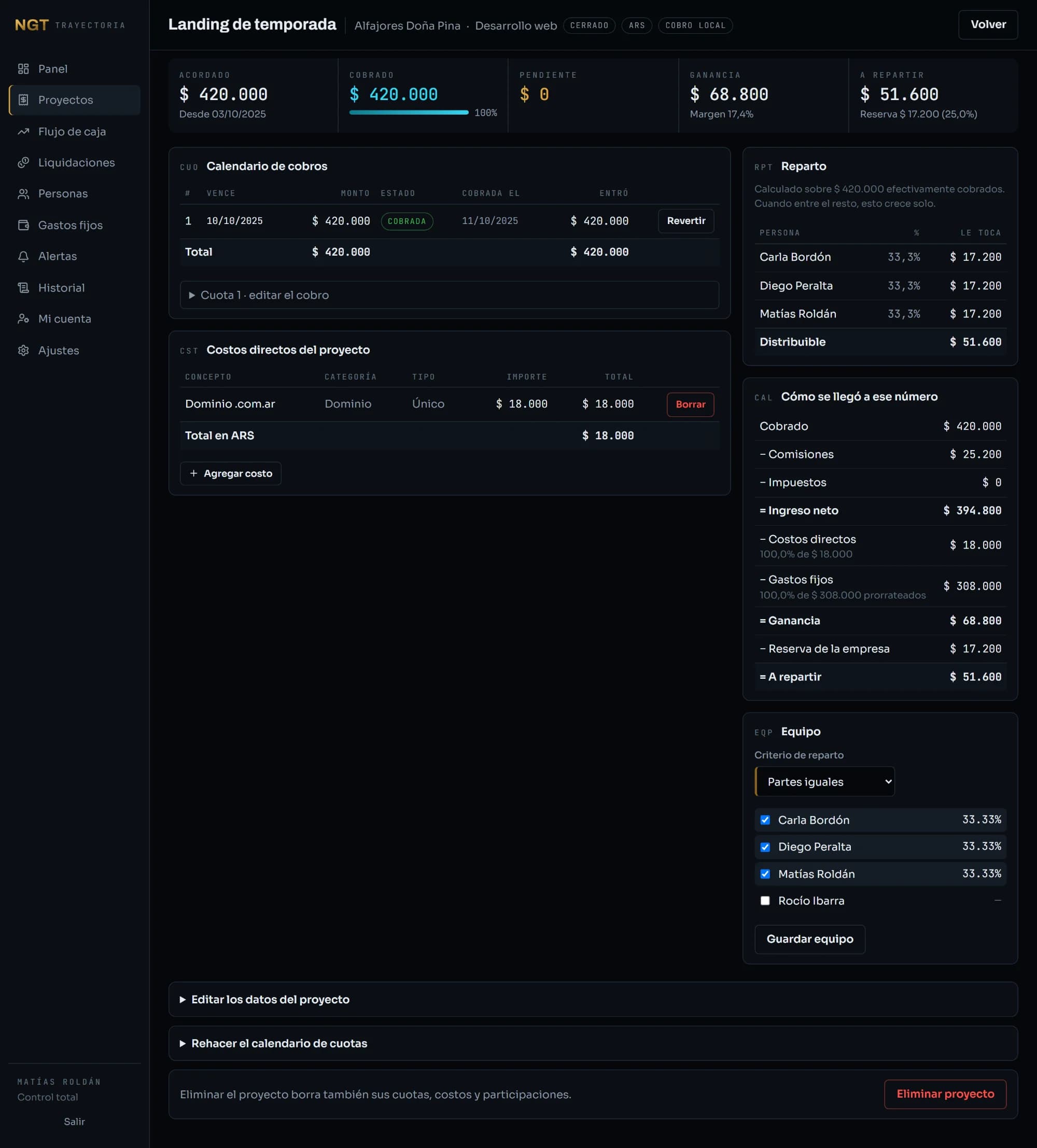
The current month, read top to bottom in the order the money leaves: collected, net income after fees and taxes, profit after project costs and its share of fixed overhead, what the company keeps in reserve, and only then what's left to split. Each figure carries its change against the previous month as an arrow and a number, never as colour alone. A dashboard you can only read by telling colours apart is a dashboard some people can't read.
The figures are set in plain ink, not colour. Five numbers in five colours is a Christmas tree: the eye has nothing to land on and none of them stands out, which is the exact opposite of what a row of figures is for. Colour is kept for two things — what there is to split, the thing you came to find out, and whatever is wrong — so that when it shows up, it means something.