NGT
Back to the case study

Full walkthrough · Marcela Carrillo · 2026

Mujeres Fierreras

A car show that used to be organised with spreadsheets and WhatsApp groups, turned into a site that registers entrants, shows the schedule and runs the voting live. These are its screens.

  • Next.js
  • App Router
  • Panel admin propio
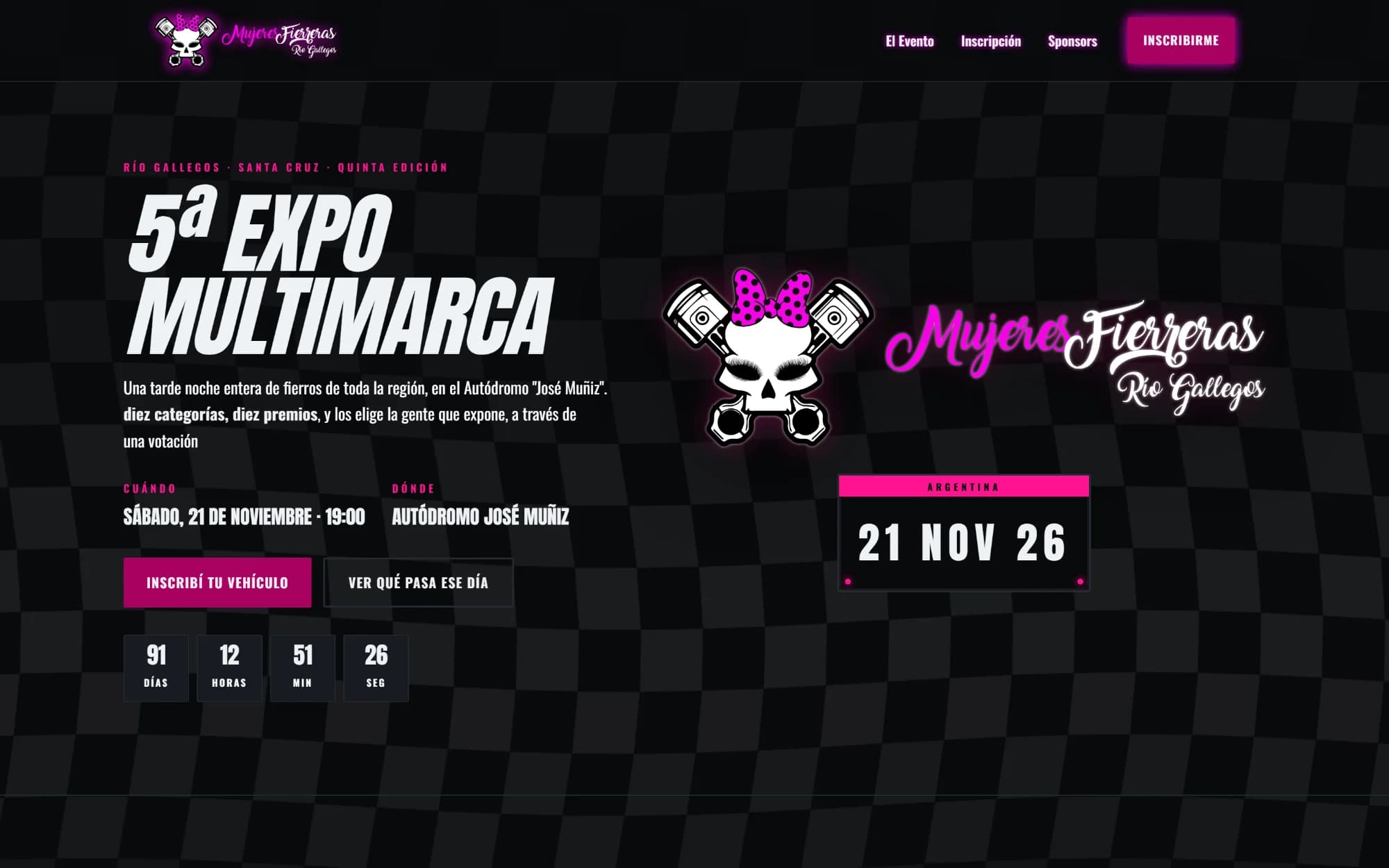
Mujeres Fierreras home page: chequered flag, pink neon logo, countdown and the date on a licence plate
The date sits on a licence plate and the countdown runs on its own. None of this is borrowed decoration: it comes from the world the event is about.

Categories

Nine categories, and one decided live

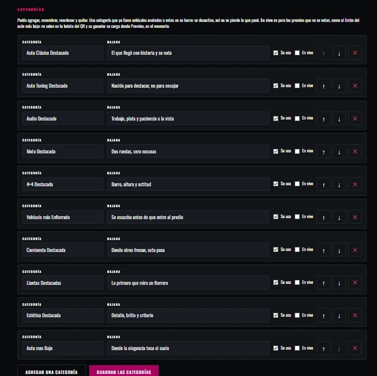
This site's catalogue is its categories: classic car, tuning, audio, motorcycle, 4×4, most kitted-out, pickup, wheels and looks. The same vehicle can enter several. The tenth — lowest car — is settled with a limbo bar that night, and so it isn't voted on: that's spelled out under the grid, where somebody will look for it.
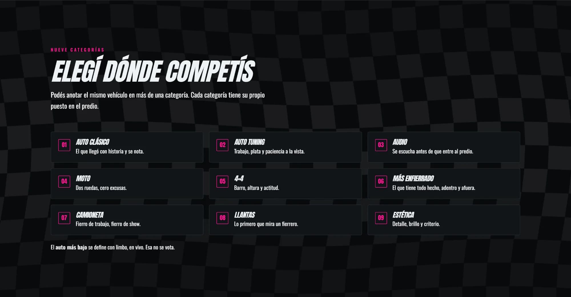
Grid of the show's nine categories, each numbered and described
The admin screen where categories are added, renamed and reordered
A category that already has vehicles entered isn't deleted: it's switched off. Deleting it would take what already happened with it, and in an annual event that is the previous edition's record.

Registration

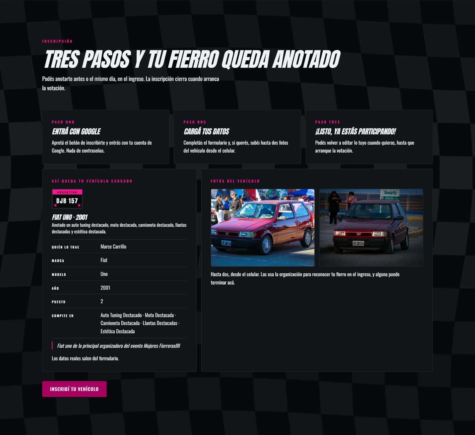
You sign up from your phone, at the gate

Sign in with Google and don't invent another password. Enter the vehicle's details and, if you like, up to two photos taken right there. And be able to edit it all until the voting starts, because people register early and change their minds later. The card below shows how it ends up: plate, model, year, which categories it's competing in and who brought it.

The three registration steps and the sample card of a registered vehicle

Voting

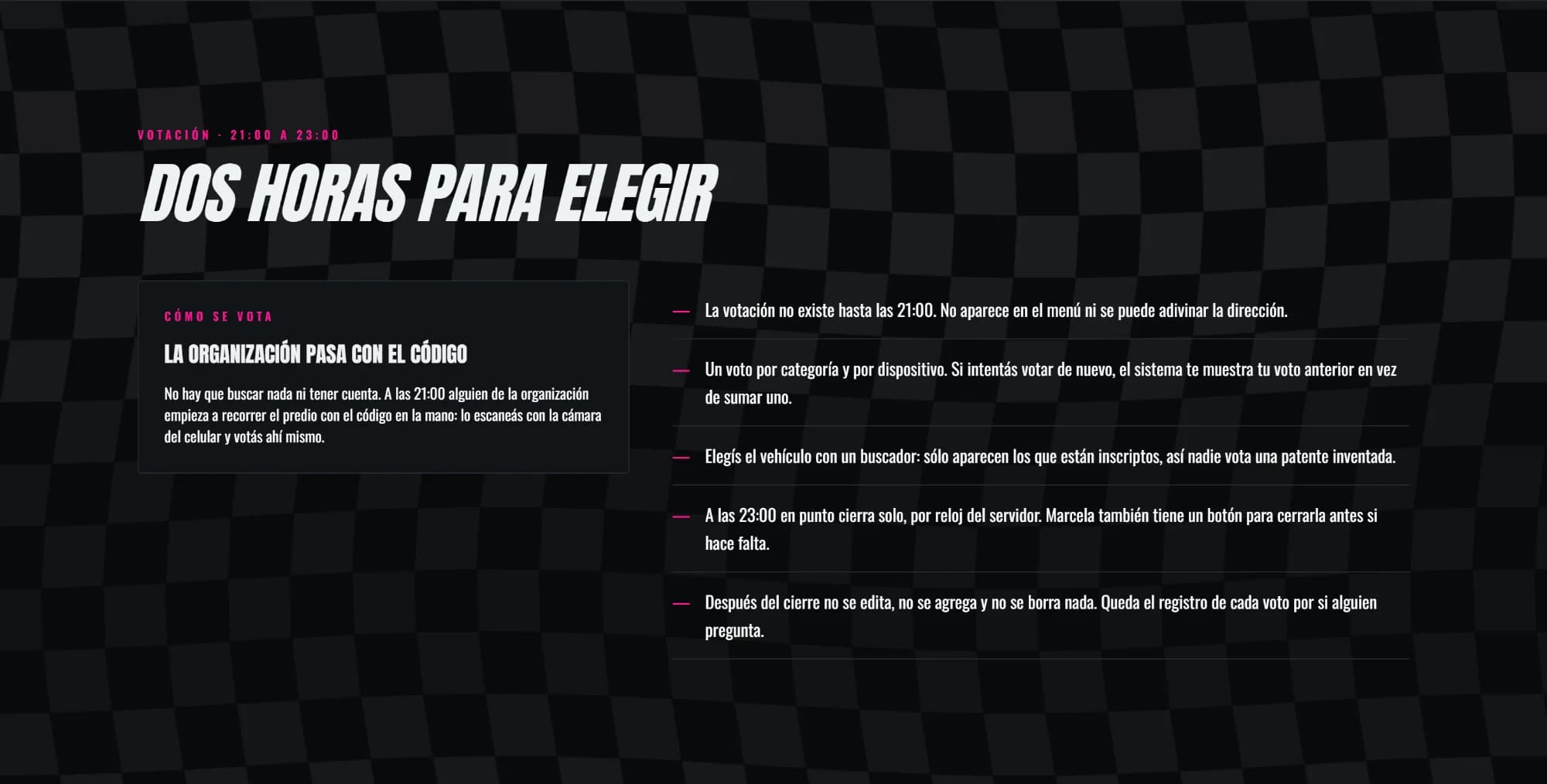
Two hours, one code and no accounts

At nine at night the organisers start walking the grounds with a printed code: you scan it with your camera and vote right there, without signing up. The interesting part is what it prevents. The vote doesn't exist before 21:00 — it isn't in the menu and the address can't be guessed — it's one vote per category per device, you can only pick from vehicles actually registered, and at 23:00 sharp it closes on its own by the server's clock, not by anyone's phone.

Section explaining how the voting works, with its rules
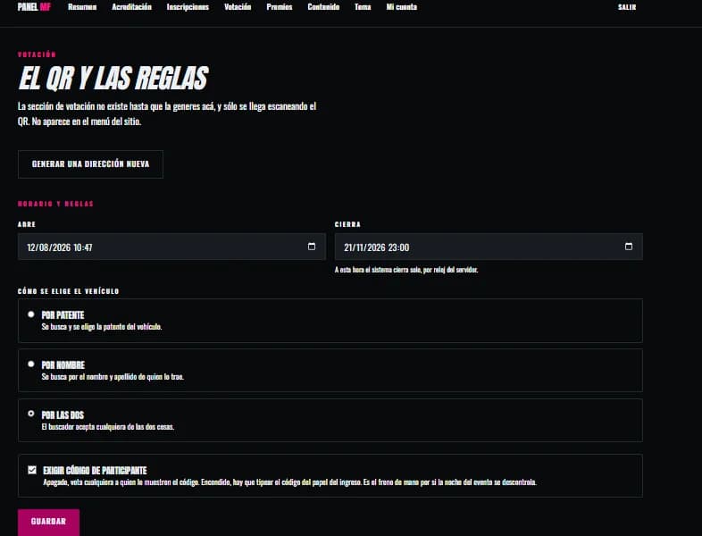
Admin screen with the voting open and close times and the search rules
Everything the organisers decide, on one screen: when it opens, when it closes — by the server's clock — whether the search is by plate or by name, and whether the code from the entry slip is required. The code block was deliberately left out of this screenshot: it holds the live voting address, and publishing it would break exactly what makes it safe.

The day

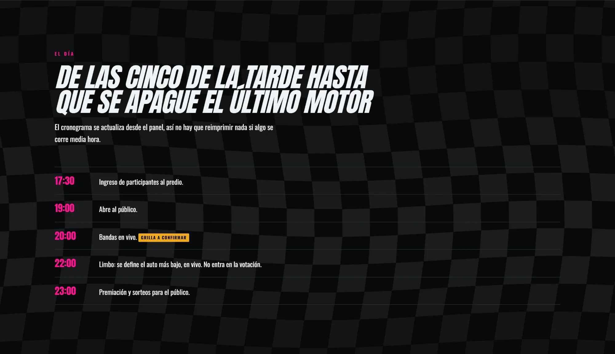
A schedule that can slip without reprinting anything

From when entrants come in to the prize-giving, hour by hour. It's edited from the admin panel, which is exactly what you need when something runs half an hour late and five hundred flyers are already printed.

The event's hour-by-hour schedule, from 17:30 to 23:00

Sponsors

The ones backing the date, with a place of their own

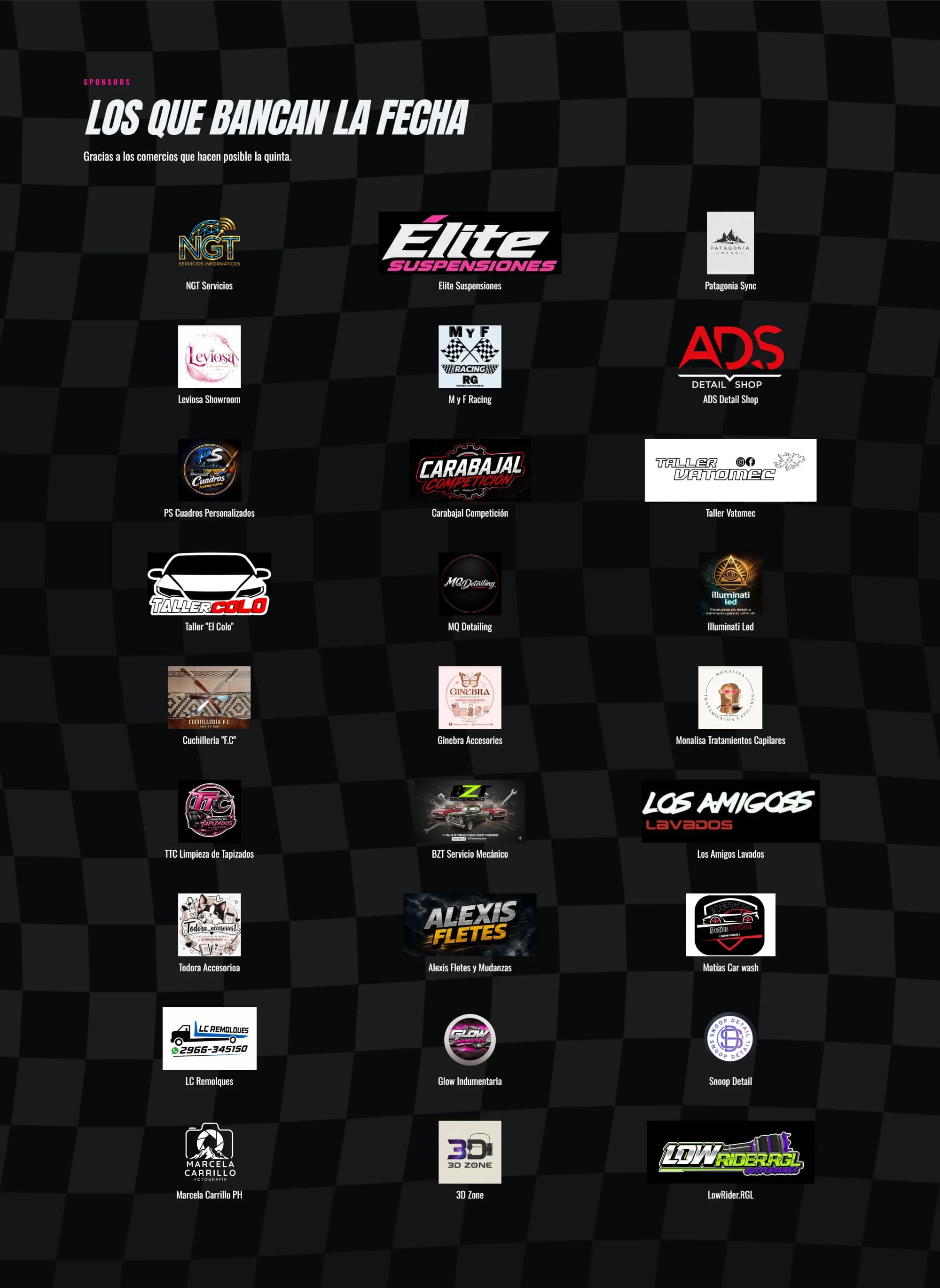
Nearly thirty businesses from Río Gallegos. For a show that runs on sponsors, this section isn't a thank-you note: it's what gets shown when you go out looking for next year's sponsor.

Grid with the logos of the businesses sponsoring the fifth show
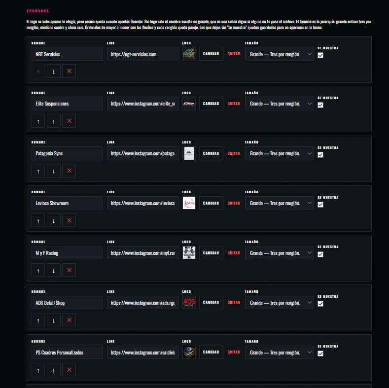
Admin screen with each sponsor, its link, its logo and the size it is shown at
Size is the hierarchy: at large, three fit per row; at medium, four; at small, six. It is decided from here, without asking anyone and without waiting for somebody to have a moment.

Admin panel

What the site says gets written here

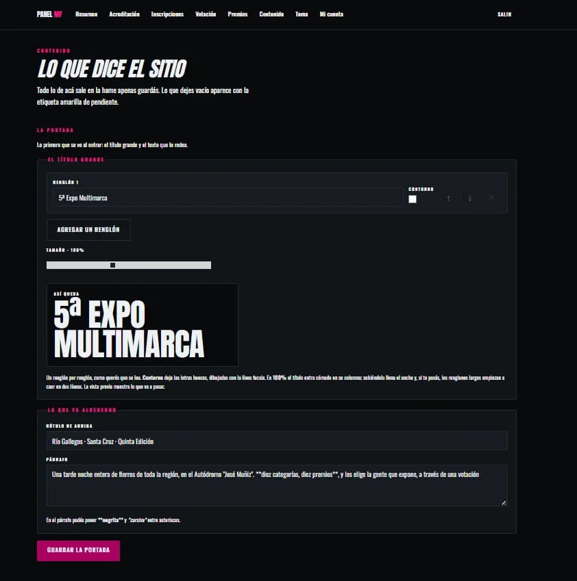
The home page's big title is built line by line, with its preview alongside: you see how it will break before saving. What is left empty doesn't come out blank on the site — it is flagged as pending in the panel, which is the difference between a half-filled site and one that tells you what it is missing.

Home page editor: title lines, a size control and a preview of the result

Theme

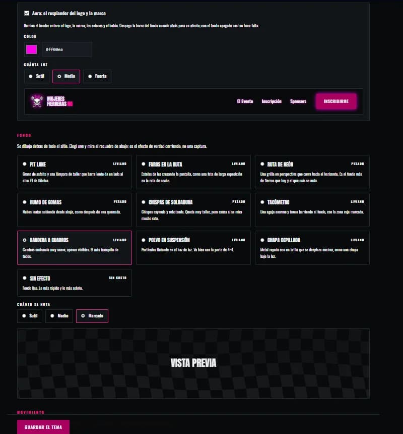
The whole site changes colour from one screen

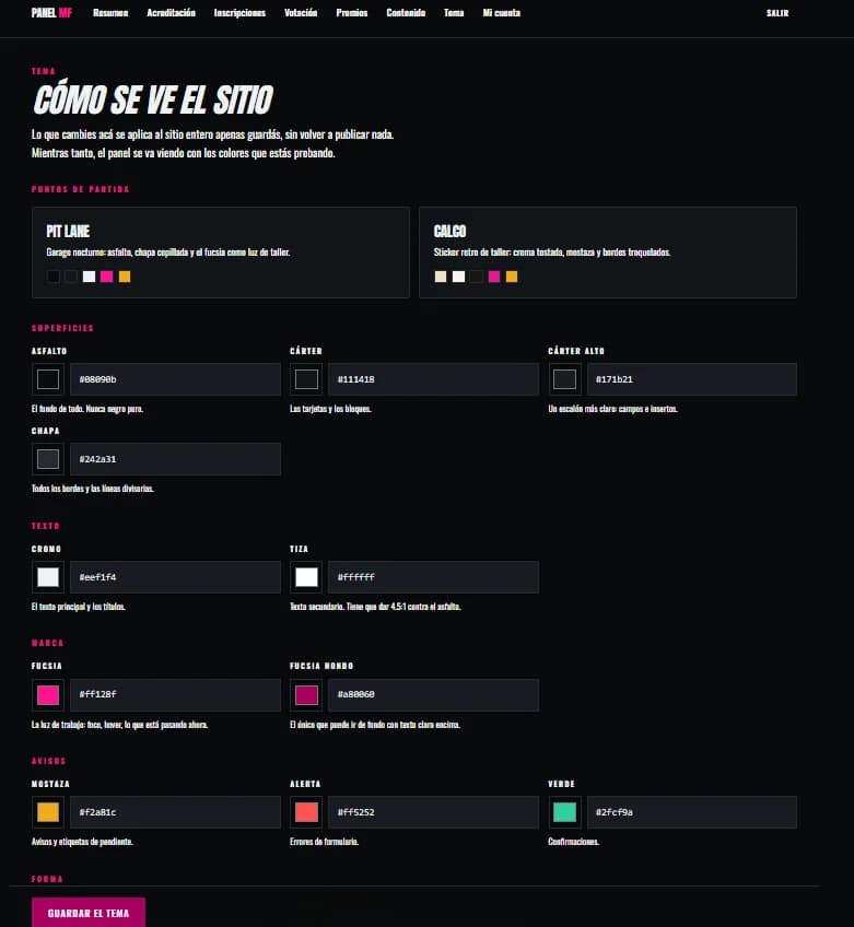
The colours aren't called PRIMARY and SECONDARY: they are called asphalt, sump, sheet metal, chrome and chalk, and each says what it is for — the background of everything, never pure black. There are two ready-made starting points, Pit Lane and Calco, so you don't begin from nothing. Below, ten animated backgrounds named from the motoring world, each marked light or heavy according to what it costs a phone. Nobody needs to know what a design token is to leave the site the way they want it.

Theme editor with colours named asphalt, sump, sheet metal, chrome, chalk and fuchsia, each with its explanation
The chalk field notes it has to reach 4.5:1 against the asphalt. The contrast requirement lives inside the panel, so it does not depend on anyone remembering.
The ten animated backgrounds to choose from, each marked light or heavy, with a preview
Tyre smoke, welding sparks, a rev counter, a chequered flag. And beside each one, what it weighs: a nice background that makes a phone sweat out in the field is worth nothing.

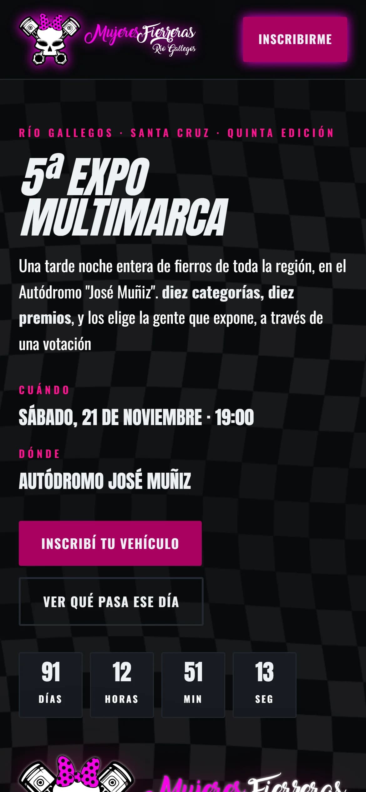
On a phone

The site gets used standing in the grounds

Almost everything here happens from a phone: registering at the gate, the vehicle photos and the nine-o'clock vote. The small screen isn't a reduced version, it's the main one.

Mujeres Fierreras home page on a phone

Want something like this for yours?

None of these sites was built from a template. Tell me what you sell and what you're fighting with today, and we'll see what can be done.